UI / UX Design
Northtara.ai: Building an AI Powered Vedic Astrology Mobile app
Northtara.ai: Building an AI Powered Vedic Astrology Mobile app
Northtara.ai: Building an AI Powered Vedic Astrology Mobile app
Could AI understand Vedic astrology well enough to actually help people? 6,000 paid users said yes.
Year :
Present
Present
Industry :
Astrology
Astrology
Client :
Northtara.ai
Northtara.ai
Project Duration :
Ongoing

Introduction
Introduction
We are a husband and wife team. Vedic astrology engineer meets product designer. We built Northtara to fix a gap no one had solved: Western apps looked great but felt hollow, Indian apps had real depth but poor experience. Ten months in, we have grown to 6,000 users with a 40–50% daily active rate and 8–12 minute average sessions, and we are now launching the mobile app.

Research & Discovery
Research & Discovery
It's not just reading stars, it's building a relationship
There were a lot of issues with how astrology apps worked.
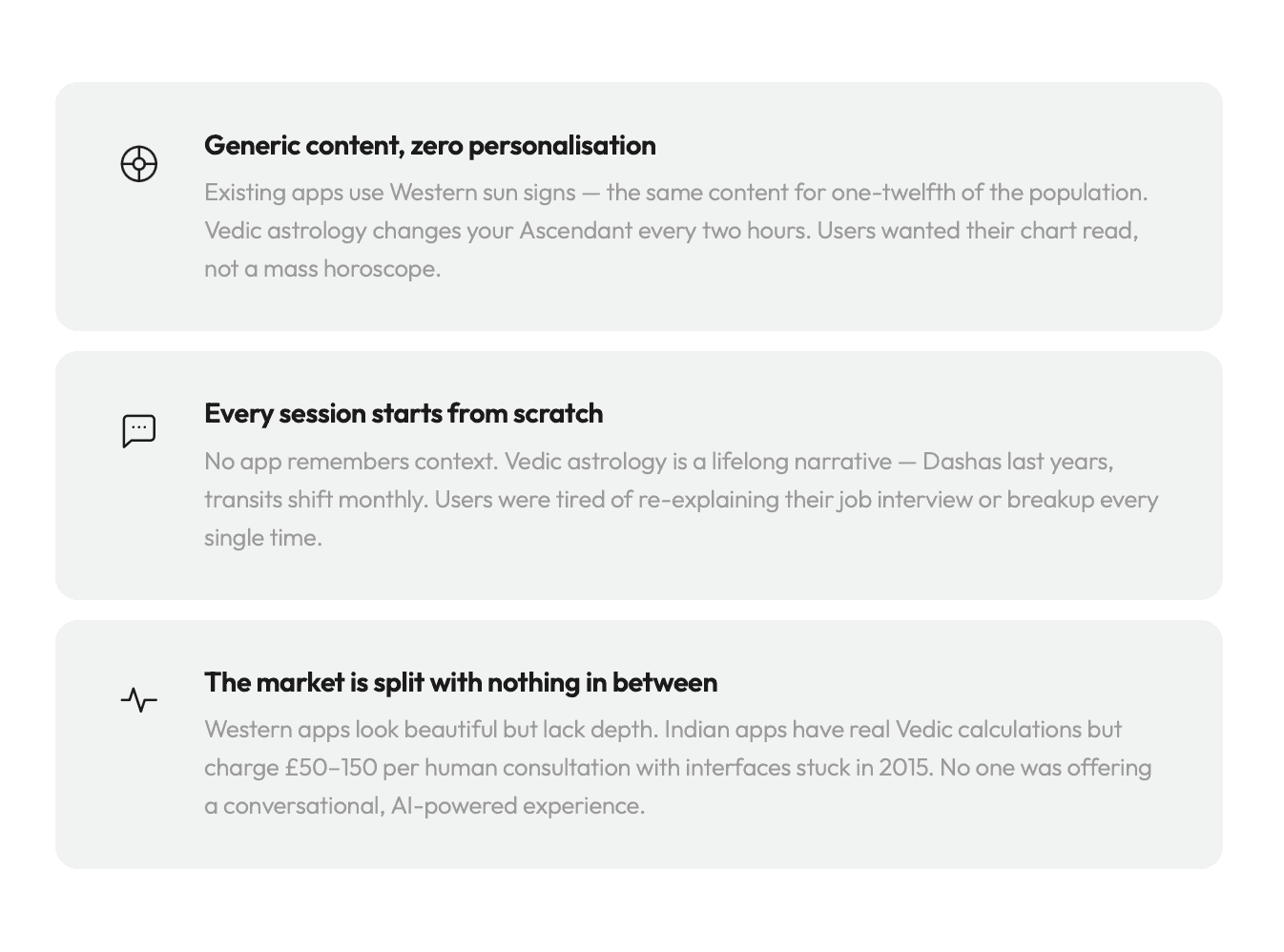

Three months of research: 25 interviews, 200 surveys, 68% response rate
Key insights
Key insights
The biggest friction is trust, not features
I spent three months interviewing 25 users across India and the UK, surveying 200 web users, auditing 12 competitor apps, and watching Reddit threads and WhatsApp groups where people were already sharing readings. The survey had a 68% response rate people genuinely wanted this solved.
People come when life gets uncertain, not on a schedule
Users don't open astrology apps daily out of habit. They come before a big decision, after a breakup, at 2 AM when they can't sleep. Our job isn't to generate daily traffic through push notifications. Our job is to be useful the moment they need us.
Voice matters more than we expected
In India, the phone consultation is the gold standard. Users were willing to pay more to talk to the AI than to type. It felt more cathartic, more human. We had originally planned for text-only this finding changed our entire product direction.
Users want control over spending, not forced subscriptions
People rejected upfront monthly fees. They wanted to pay for what they used. Trust was earned through transparency, not locked behind a paywall. This shaped our entire monetisation model.
Watching real users complete onboarding testing for friction in every tap
Product structure & initial insights
Product structure & initial insights
Not another daily horoscope app
After three months of research, I had clarity on what the mobile app needed to be. We weren't building a content feed people scroll through. We were building a guru in your pocket someone you turn to when life gets uncertain.
The app needed four layers, each serving a different moment. A daily entry point a personalised shloka and today's planetary weather gives users a reason to open the app without being nagged. Immediate AI access sits one tap away because the core value is the conversation, not the content around it. A community space lets users see other people's questions and realise they're not alone. And depth reports exist for users who want a full roadmap of their career, relationships, or year ahead.
The hierarchy was deliberate. Free content pulls people in daily. The AI conversation converts them. Community builds habit. Reports generate revenue.

Mapping every user moment from curiosity to conversion to habit

Four layers: daily hook, AI conversation, community, deep dives
Competitive analysis
Competitive analysis
I tested 12 astrology apps. Here's what I found.
I audited every major player end to end onboarding, daily experience, monetisation, chat, community. The market broke into two camps. Co-Star and Sanctuary had polished interfaces but relied on Western sun signs with no conversational layer. AstroTalk offered genuine Vedic calculations but only through expensive human consultants with outdated UI. The Pattern had strong community features but no personalised charts at all.
The gap was clear. No one combined Vedic accuracy, AI conversation, context memory, voice, and a modern interface. All five together that was the opportunity.

The gap: no one combined Vedic accuracy, AI chat, voice, and modern UI
Design Strategy
Design Strategy
Why monochrome
Every astrology app uses the same language: deep purples, cosmic blues, glowing particles. It makes them all blend together and feel a bit unserious.
We went the opposite direction. Pure black and white. No brand colour. No gradients. If the content is sacred, the container shouldn't compete with it. The interface should feel like reading a beautifully set book, not using an app.
The design system
I built the system from scratch: five greyscale values, a 12 level type scale using Playfair Display and Outfit, 41 custom stroke based SVG icons, and component specs for every element in the app. Since I'm also writing the front-end code, the design system isn't a Figma artefact it's the actual constants and components in the React Native codebase.

Built from scratch: 5 greys, 12 type levels, 41 custom SVG icons design system as living code
Information Architecture
Information Architecture
Two taps to anything
Four tabs at the bottom: Home, Insights, Learn, Community. Profile lives behind an avatar in the top right. Guruji is accessible from Home and from within any reading never more than one tap away.
Home is the hub. Everything fans out from a single scroll: daily stories, prediction hero, Guruji CTA, subscription status, Deep Dives, and a Learn plus Community shortcut row. Insights holds transit details and Dasha timelines. Learn is a topic grid covering Nakshatras, Yogas, Dashas, and Remedies. Community is the public Q&A feed.
Profile contains plan status, credit balance, chat history, saved Deep Dives, partner management, and settings all on one scroll, no nested navigation. Twenty-two screens total across eight flows. Every screen is reachable within two taps from Home.

22 screens, 8 flows every screen reachable within two taps from Home
Ideation & Concept Development
Ideation & Concept Development
The web app was intentionally exploratory you could browse predictions, read learn content, and get a feel for Bhaskar without ever creating an account. Auth0 handled authentication where it was needed, but its technical limitations meant we couldn't shape that sign in experience to feel native to the product. It was a boundary we worked around rather than designed with. When we made the decision to build for mobile, we used it as a reset. Mobile is a more committed relationship you're adding it to your home screen, you're giving it space in your day. So we moved sign in to the very first moment, and rebuilt the entire onboarding ourselves. What had been a single screen asking for name, email, and birth details losing 38% of users before they got through became six considered steps: OAuth entry, a feature walkthrough, a welcome screen, then birth details across three calm scroll pickers. Drop off fell to 15%. The web taught us what people were curious about. Mobile is where we designed for people who'd already decided.
Building the front end
I'm not just the designer here, I'm writing the React Native code. Every design decision had to survive contact with implementation. The scroll pickers were prototyped in React before the Figma mockup was final. The voice orb's gradient transitions were tested in code before being specced.
The complete onboarding flow, dashboard, text and voice chat, community feed and question detail, Deep Dive reader with audio, profile, subscriptions, multi-partner system, notifications, and a live design system document , the back end LLM integration, JPL Development Ephemeris, WebRTC, MongoDB, PostgreSQL is my co-founder's domain, though I have been deeply involved in prompt engineering and context window management to keep Guruji's personality consistent.
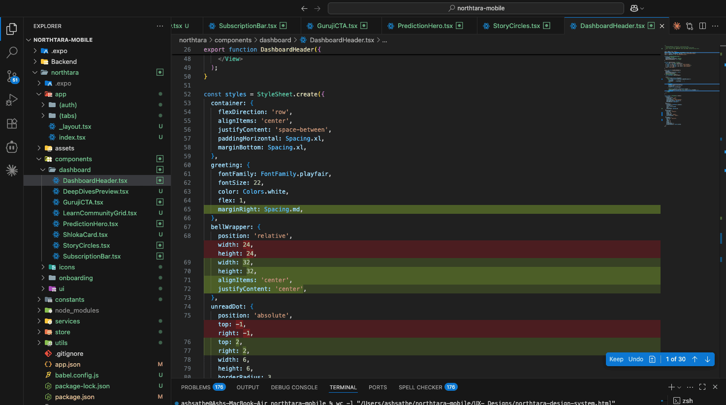
Not just designed built. React Native, front-end coded start to finish by the designer
What changed through iteration
What changed through iteration
Almost every screen went through two to four rounds. The pattern was always the same: the changes that worked best were about removing things, not adding them. Removing the all in one birth form cut drop offs by 23 points. Removing per message credit anxiety nearly halved voice session exits. Removing the category dropdown from question posting increased engagement. Moving the audio player out of a sticky bar and into the content lifted listening by 35%.
If a user has to think about the interface, the interface is wrong. The chart, Guruji's words, the community that's the product. Everything else should disappear.

Deep Dives reimagined: from web reports to a mobile reading experience with inline audio

Every round stripped away complexity the interface disappears, the content stays
Impact and Outcomes
Impact and Outcomes
The numbers
Six thousand registered users, entirely organic. 40–50% daily active rate. 8-12 minute average sessions. 15% conversion to paid credits. The most loyal 15% of paying users drive roughly 60% of revenue.
Onboarding completion improved from 62% to 85%. Voice session completion nearly doubled. Audio engagement on Deep Dives went from negligible to 35% of readers using the player. Community reached self-sustaining activity within one week. Report cart abandonment dropped to 12%.
What's next
The mobile app launches late April 2026 on iOS and Android. After launch: Muhurta timing for life events, Kundli matching for marriage compatibility, and subscription modals.
This has been the most complex design challenge I've worked on. Not because of visual complexity the UI is deliberately simple. But because of the depth of the domain, the sensitivity of the content, and the ambition of building an AI that earns genuine trust in a space where people are making real life decisions.
Want to see more?
I'm happy to walk through the full user flows, system architecture, or design system in detail. Reach out at ash@northtara.ai
More Projects


UI / UX Design
Northtara.ai: Building an AI Powered Vedic Astrology Mobile app
Northtara.ai: Building an AI Powered Vedic Astrology Mobile app
Northtara.ai: Building an AI Powered Vedic Astrology Mobile app
Could AI understand Vedic astrology well enough to actually help people? 6,000 paid users said yes.
Year :
Present
Present
Industry :
Astrology
Astrology
Client :
Northtara.ai
Northtara.ai
Project Duration :
Ongoing
Introduction
Introduction
We are a husband and wife team. Vedic astrology engineer meets product designer. We built Northtara to fix a gap no one had solved: Western apps looked great but felt hollow, Indian apps had real depth but poor experience. Ten months in, we have grown to 6,000 users with a 40–50% daily active rate and 8–12 minute average sessions, and we are now launching the mobile app.
Research & Discovery
Research & Discovery
It's not just reading stars, it's building a relationship
There were a lot of issues with how astrology apps worked.
Three months of research: 25 interviews, 200 surveys, 68% response rate
Key insights
Key insights
The biggest friction is trust, not features
I spent three months interviewing 25 users across India and the UK, surveying 200 web users, auditing 12 competitor apps, and watching Reddit threads and WhatsApp groups where people were already sharing readings. The survey had a 68% response rate people genuinely wanted this solved.
People come when life gets uncertain, not on a schedule
Users don't open astrology apps daily out of habit. They come before a big decision, after a breakup, at 2 AM when they can't sleep. Our job isn't to generate daily traffic through push notifications. Our job is to be useful the moment they need us.
Voice matters more than we expected
In India, the phone consultation is the gold standard. Users were willing to pay more to talk to the AI than to type. It felt more cathartic, more human. We had originally planned for text-only this finding changed our entire product direction.
Users want control over spending, not forced subscriptions
People rejected upfront monthly fees. They wanted to pay for what they used. Trust was earned through transparency, not locked behind a paywall. This shaped our entire monetisation model.
Watching real users complete onboarding testing for friction in every tap
Product structure & initial insights
Product structure & initial insights
Not another daily horoscope app
After three months of research, I had clarity on what the mobile app needed to be. We weren't building a content feed people scroll through. We were building a guru in your pocket someone you turn to when life gets uncertain.
The app needed four layers, each serving a different moment. A daily entry point a personalised shloka and today's planetary weather gives users a reason to open the app without being nagged. Immediate AI access sits one tap away because the core value is the conversation, not the content around it. A community space lets users see other people's questions and realise they're not alone. And depth reports exist for users who want a full roadmap of their career, relationships, or year ahead.
The hierarchy was deliberate. Free content pulls people in daily. The AI conversation converts them. Community builds habit. Reports generate revenue.
Mapping every user moment from curiosity to conversion to habit
Four layers: daily hook, AI conversation, community, deep dives
Competitive analysis
Competitive analysis
I tested 12 astrology apps. Here's what I found.
I audited every major player end to end onboarding, daily experience, monetisation, chat, community. The market broke into two camps. Co-Star and Sanctuary had polished interfaces but relied on Western sun signs with no conversational layer. AstroTalk offered genuine Vedic calculations but only through expensive human consultants with outdated UI. The Pattern had strong community features but no personalised charts at all.
The gap was clear. No one combined Vedic accuracy, AI conversation, context memory, voice, and a modern interface. All five together that was the opportunity.
The gap: no one combined Vedic accuracy, AI chat, voice, and modern UI
Design Strategy
Design Strategy
Why monochrome
Every astrology app uses the same language: deep purples, cosmic blues, glowing particles. It makes them all blend together and feel a bit unserious.
We went the opposite direction. Pure black and white. No brand colour. No gradients. If the content is sacred, the container shouldn't compete with it. The interface should feel like reading a beautifully set book, not using an app.
The design system
I built the system from scratch: five greyscale values, a 12 level type scale using Playfair Display and Outfit, 41 custom stroke based SVG icons, and component specs for every element in the app. Since I'm also writing the front-end code, the design system isn't a Figma artefact it's the actual constants and components in the React Native codebase.
Built from scratch: 5 greys, 12 type levels, 41 custom SVG icons design system as living code
Information Architecture
Information Architecture
Two taps to anything
Four tabs at the bottom: Home, Insights, Learn, Community. Profile lives behind an avatar in the top right. Guruji is accessible from Home and from within any reading never more than one tap away.
Home is the hub. Everything fans out from a single scroll: daily stories, prediction hero, Guruji CTA, subscription status, Deep Dives, and a Learn plus Community shortcut row. Insights holds transit details and Dasha timelines. Learn is a topic grid covering Nakshatras, Yogas, Dashas, and Remedies. Community is the public Q&A feed.
Profile contains plan status, credit balance, chat history, saved Deep Dives, partner management, and settings all on one scroll, no nested navigation. Twenty-two screens total across eight flows. Every screen is reachable within two taps from Home.
22 screens, 8 flows every screen reachable within two taps from Home
Ideation & Concept Development
Ideation & Concept Development
The web app was intentionally exploratory you could browse predictions, read learn content, and get a feel for Bhaskar without ever creating an account. Auth0 handled authentication where it was needed, but its technical limitations meant we couldn't shape that sign in experience to feel native to the product. It was a boundary we worked around rather than designed with. When we made the decision to build for mobile, we used it as a reset. Mobile is a more committed relationship you're adding it to your home screen, you're giving it space in your day. So we moved sign in to the very first moment, and rebuilt the entire onboarding ourselves. What had been a single screen asking for name, email, and birth details losing 38% of users before they got through became six considered steps: OAuth entry, a feature walkthrough, a welcome screen, then birth details across three calm scroll pickers. Drop off fell to 15%. The web taught us what people were curious about. Mobile is where we designed for people who'd already decided.
Building the front end
I'm not just the designer here, I'm writing the React Native code. Every design decision had to survive contact with implementation. The scroll pickers were prototyped in React before the Figma mockup was final. The voice orb's gradient transitions were tested in code before being specced.
The complete onboarding flow, dashboard, text and voice chat, community feed and question detail, Deep Dive reader with audio, profile, subscriptions, multi-partner system, notifications, and a live design system document , the back end LLM integration, JPL Development Ephemeris, WebRTC, MongoDB, PostgreSQL is my co-founder's domain, though I have been deeply involved in prompt engineering and context window management to keep Guruji's personality consistent.
Not just designed built. React Native, front-end coded start to finish by the designer
What changed through iteration
What changed through iteration
Almost every screen went through two to four rounds. The pattern was always the same: the changes that worked best were about removing things, not adding them. Removing the all in one birth form cut drop offs by 23 points. Removing per message credit anxiety nearly halved voice session exits. Removing the category dropdown from question posting increased engagement. Moving the audio player out of a sticky bar and into the content lifted listening by 35%.
If a user has to think about the interface, the interface is wrong. The chart, Guruji's words, the community that's the product. Everything else should disappear.
Deep Dives reimagined: from web reports to a mobile reading experience with inline audio
Every round stripped away complexity the interface disappears, the content stays
Impact and Outcomes
Impact and Outcomes
The numbers
Six thousand registered users, entirely organic. 40–50% daily active rate. 8-12 minute average sessions. 15% conversion to paid credits. The most loyal 15% of paying users drive roughly 60% of revenue.
Onboarding completion improved from 62% to 85%. Voice session completion nearly doubled. Audio engagement on Deep Dives went from negligible to 35% of readers using the player. Community reached self-sustaining activity within one week. Report cart abandonment dropped to 12%.
What's next
The mobile app launches late April 2026 on iOS and Android. After launch: Muhurta timing for life events, Kundli matching for marriage compatibility, and subscription modals.
This has been the most complex design challenge I've worked on. Not because of visual complexity the UI is deliberately simple. But because of the depth of the domain, the sensitivity of the content, and the ambition of building an AI that earns genuine trust in a space where people are making real life decisions.
Want to see more?
I'm happy to walk through the full user flows, system architecture, or design system in detail. Reach out at ash@northtara.ai
More Projects
UI / UX Design
Northtara.ai: Building an AI Powered Vedic Astrology Mobile app
Northtara.ai: Building an AI Powered Vedic Astrology Mobile app
Northtara.ai: Building an AI Powered Vedic Astrology Mobile app
Could AI understand Vedic astrology well enough to actually help people? 6,000 paid users said yes.
Year :
Present
Present
Industry :
Astrology
Astrology
Client :
Northtara.ai
Northtara.ai
Project Duration :
Ongoing
Introduction
Introduction
We are a husband and wife team. Vedic astrology engineer meets product designer. We built Northtara to fix a gap no one had solved: Western apps looked great but felt hollow, Indian apps had real depth but poor experience. Ten months in, we have grown to 6,000 users with a 40–50% daily active rate and 8–12 minute average sessions, and we are now launching the mobile app.
Research & Discovery
Research & Discovery
It's not just reading stars, it's building a relationship
There were a lot of issues with how astrology apps worked.
Three months of research: 25 interviews, 200 surveys, 68% response rate
Key insights
Key insights
The biggest friction is trust, not features
I spent three months interviewing 25 users across India and the UK, surveying 200 web users, auditing 12 competitor apps, and watching Reddit threads and WhatsApp groups where people were already sharing readings. The survey had a 68% response rate people genuinely wanted this solved.
People come when life gets uncertain, not on a schedule
Users don't open astrology apps daily out of habit. They come before a big decision, after a breakup, at 2 AM when they can't sleep. Our job isn't to generate daily traffic through push notifications. Our job is to be useful the moment they need us.
Voice matters more than we expected
In India, the phone consultation is the gold standard. Users were willing to pay more to talk to the AI than to type. It felt more cathartic, more human. We had originally planned for text-only this finding changed our entire product direction.
Users want control over spending, not forced subscriptions
People rejected upfront monthly fees. They wanted to pay for what they used. Trust was earned through transparency, not locked behind a paywall. This shaped our entire monetisation model.
Watching real users complete onboarding testing for friction in every tap
Product structure & initial insights
Product structure & initial insights
Not another daily horoscope app
After three months of research, I had clarity on what the mobile app needed to be. We weren't building a content feed people scroll through. We were building a guru in your pocket someone you turn to when life gets uncertain.
The app needed four layers, each serving a different moment. A daily entry point a personalised shloka and today's planetary weather gives users a reason to open the app without being nagged. Immediate AI access sits one tap away because the core value is the conversation, not the content around it. A community space lets users see other people's questions and realise they're not alone. And depth reports exist for users who want a full roadmap of their career, relationships, or year ahead.
The hierarchy was deliberate. Free content pulls people in daily. The AI conversation converts them. Community builds habit. Reports generate revenue.
Mapping every user moment from curiosity to conversion to habit
Four layers: daily hook, AI conversation, community, deep dives
Competitive analysis
Competitive analysis
I tested 12 astrology apps. Here's what I found.
I audited every major player end to end onboarding, daily experience, monetisation, chat, community. The market broke into two camps. Co-Star and Sanctuary had polished interfaces but relied on Western sun signs with no conversational layer. AstroTalk offered genuine Vedic calculations but only through expensive human consultants with outdated UI. The Pattern had strong community features but no personalised charts at all.
The gap was clear. No one combined Vedic accuracy, AI conversation, context memory, voice, and a modern interface. All five together that was the opportunity.
The gap: no one combined Vedic accuracy, AI chat, voice, and modern UI
Design Strategy
Design Strategy
Why monochrome
Every astrology app uses the same language: deep purples, cosmic blues, glowing particles. It makes them all blend together and feel a bit unserious.
We went the opposite direction. Pure black and white. No brand colour. No gradients. If the content is sacred, the container shouldn't compete with it. The interface should feel like reading a beautifully set book, not using an app.
The design system
I built the system from scratch: five greyscale values, a 12 level type scale using Playfair Display and Outfit, 41 custom stroke based SVG icons, and component specs for every element in the app. Since I'm also writing the front-end code, the design system isn't a Figma artefact it's the actual constants and components in the React Native codebase.
Built from scratch: 5 greys, 12 type levels, 41 custom SVG icons design system as living code
Information Architecture
Information Architecture
Two taps to anything
Four tabs at the bottom: Home, Insights, Learn, Community. Profile lives behind an avatar in the top right. Guruji is accessible from Home and from within any reading never more than one tap away.
Home is the hub. Everything fans out from a single scroll: daily stories, prediction hero, Guruji CTA, subscription status, Deep Dives, and a Learn plus Community shortcut row. Insights holds transit details and Dasha timelines. Learn is a topic grid covering Nakshatras, Yogas, Dashas, and Remedies. Community is the public Q&A feed.
Profile contains plan status, credit balance, chat history, saved Deep Dives, partner management, and settings all on one scroll, no nested navigation. Twenty-two screens total across eight flows. Every screen is reachable within two taps from Home.
22 screens, 8 flows every screen reachable within two taps from Home
Ideation & Concept Development
Ideation & Concept Development
The web app was intentionally exploratory you could browse predictions, read learn content, and get a feel for Bhaskar without ever creating an account. Auth0 handled authentication where it was needed, but its technical limitations meant we couldn't shape that sign in experience to feel native to the product. It was a boundary we worked around rather than designed with. When we made the decision to build for mobile, we used it as a reset. Mobile is a more committed relationship you're adding it to your home screen, you're giving it space in your day. So we moved sign in to the very first moment, and rebuilt the entire onboarding ourselves. What had been a single screen asking for name, email, and birth details losing 38% of users before they got through became six considered steps: OAuth entry, a feature walkthrough, a welcome screen, then birth details across three calm scroll pickers. Drop off fell to 15%. The web taught us what people were curious about. Mobile is where we designed for people who'd already decided.
Building the front end
I'm not just the designer here, I'm writing the React Native code. Every design decision had to survive contact with implementation. The scroll pickers were prototyped in React before the Figma mockup was final. The voice orb's gradient transitions were tested in code before being specced.
The complete onboarding flow, dashboard, text and voice chat, community feed and question detail, Deep Dive reader with audio, profile, subscriptions, multi-partner system, notifications, and a live design system document , the back end LLM integration, JPL Development Ephemeris, WebRTC, MongoDB, PostgreSQL is my co-founder's domain, though I have been deeply involved in prompt engineering and context window management to keep Guruji's personality consistent.
Not just designed built. React Native, front-end coded start to finish by the designer
What changed through iteration
What changed through iteration
Almost every screen went through two to four rounds. The pattern was always the same: the changes that worked best were about removing things, not adding them. Removing the all in one birth form cut drop offs by 23 points. Removing per message credit anxiety nearly halved voice session exits. Removing the category dropdown from question posting increased engagement. Moving the audio player out of a sticky bar and into the content lifted listening by 35%.
If a user has to think about the interface, the interface is wrong. The chart, Guruji's words, the community that's the product. Everything else should disappear.
Deep Dives reimagined: from web reports to a mobile reading experience with inline audio
Every round stripped away complexity the interface disappears, the content stays
Impact and Outcomes
Impact and Outcomes
The numbers
Six thousand registered users, entirely organic. 40–50% daily active rate. 8-12 minute average sessions. 15% conversion to paid credits. The most loyal 15% of paying users drive roughly 60% of revenue.
Onboarding completion improved from 62% to 85%. Voice session completion nearly doubled. Audio engagement on Deep Dives went from negligible to 35% of readers using the player. Community reached self-sustaining activity within one week. Report cart abandonment dropped to 12%.
What's next
The mobile app launches late April 2026 on iOS and Android. After launch: Muhurta timing for life events, Kundli matching for marriage compatibility, and subscription modals.
This has been the most complex design challenge I've worked on. Not because of visual complexity the UI is deliberately simple. But because of the depth of the domain, the sensitivity of the content, and the ambition of building an AI that earns genuine trust in a space where people are making real life decisions.
Want to see more?
I'm happy to walk through the full user flows, system architecture, or design system in detail. Reach out at ash@northtara.ai