UI / UX Design
Axios: Building trust in ad-tech brand, platform & zero to one
Axios: Building trust in ad-tech brand, platform & zero to one
Axios: Building trust in ad-tech brand, platform & zero to one
Axios had no brand, no website, no product. I designed everything from identity to a full AI powered fraud protection platform in 8 weeks.
Year :
2025
2025
Industry :
Finance
Finance
Client :
Axios
Axios
Project Duration :
8 Weeks

Introduction
Introduction
Axios had a fraud detection engine that outperformed competitors but no brand, no website, and no product UI. My job was to build everything from identity to a full AI powered platform in 8 weeks, working with a two person engineering team.
Ad tech buyers have been burned by tools that overpromise and show no proof. Every decision in this project had to earn trust before asking for it.
The Gap: I audited ClickCease, TrafficGuard, CHEQ, and Improvely 48 screens mapped. Same pattern everywhere: show a number, say trust us, explain nothing. No competitor made fraud protection feel approachable or gave users real control.
The opportunity wasn't better detection Axios already had that. It was better communication of what the detection was doing, in money terms, with proof users could verify.
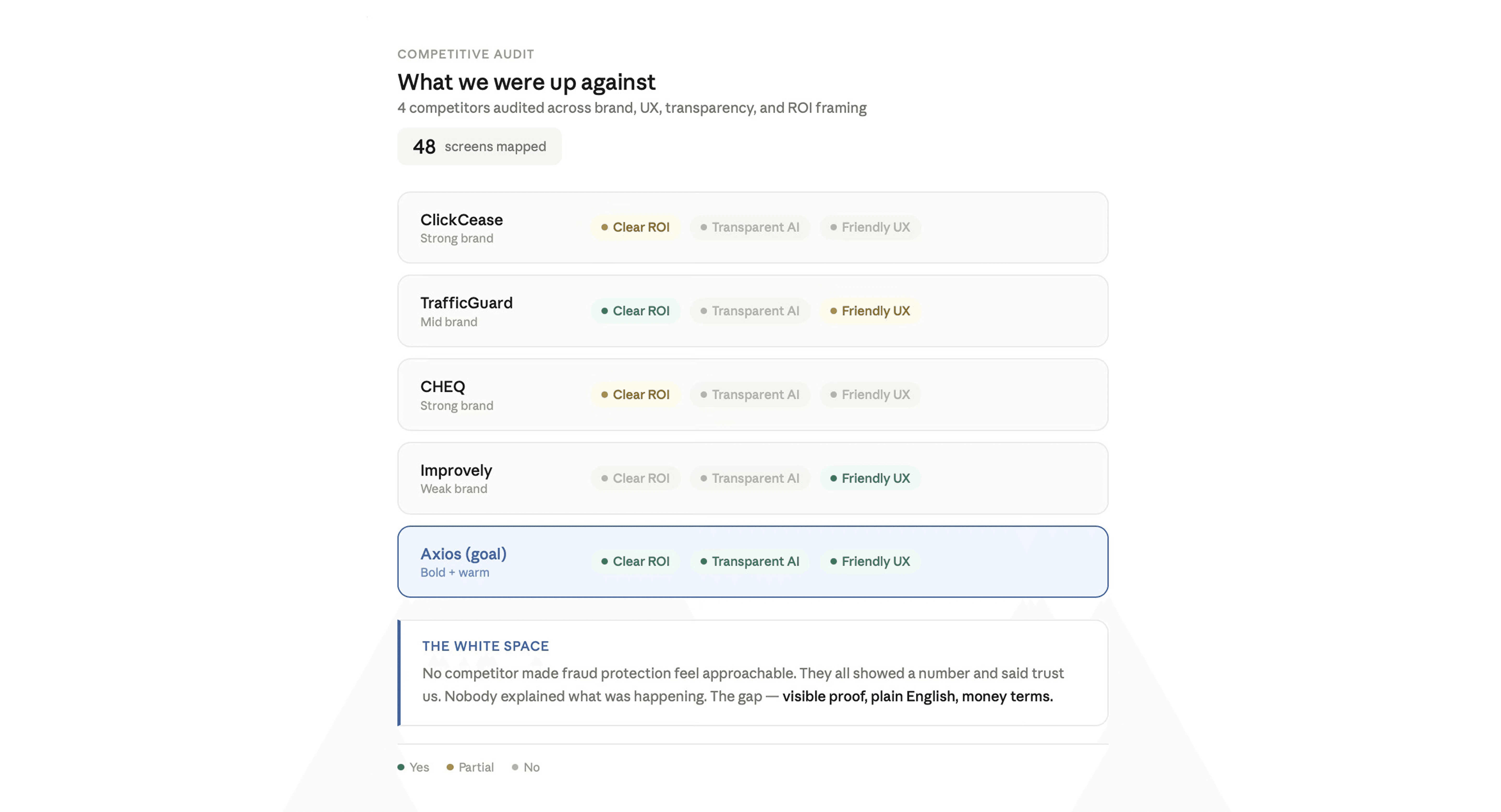
Every competitor showed a number and asked for trust. None made fraud protection feel approachable, transparent, or real
Research & Discovery
Research & Discovery
6 user interviews, 94 support tickets analysed, 4 competitive teardowns, and a card sort on terminology. No design until week 3. The founder wanted screens I argued that designing the wrong thing fast costs more. He agreed if I presented clear findings by end of week 2.
What changed everything:
Fear of false positives was bigger than fear of fraud. 3 of 6 users had churned from a previous tool for blocking real customers. This reshaped the entire control model every rule toggleable, every threshold adjustable. Every user defined success in money, not percentages. How much did you save me not what percentage was cleaner. The product's own language was wrong.
31% of support tickets were I don't know if it's working. Users couldn't tell if their tool was active. This became the core principle: always show proof. Setup abandonment was the #1 churn driver. 18 minute average time to value across competitors. Users who didn't see value in session one didn't return.

8 interviews, 94 support tickets, 4 teardowns. Fear of false positives outweighed fear of fraud — and 31% of tickets were users asking if the tool was even working.
Design Principles- from research to rules
Design Principles- from research to rules
Four rules every screen had to pass, signed off before any visual work:
Always show proof: no silent blocking, every action visible. Translate to money: "$340.40 protected" not "21 clicks blocked." User stays in control : every rule toggleable, product advises, user decides. First value in 3 minutes : if it doesn't land in session one, there's no session two.
Design Decisions
Design Decisions
Two rounds of concept testing, 5 participants each.
Killed: Security-enforcement brand. Lock icons, shield motifs, red warnings. 3 of 5 called it intimidating, it amplified false positive anxiety. 20% three day recall.
Killed: Light dashboard. Users spend 6+ hours daily in Google/Meta Ads Manager, both dark. A bright UI read as marketing site, not work tool.
Kept: Approachable ally brand. Warm but precise, protective not punitive. 80% three day recall. First fraud tool that felt like it was on my side.
Pivoted: Dollar amounts lead. Users skipped 12% cleaner traffic. One participant leaned forward at $340.40 protected this week.
Kept: 4 step wizard. Single form: 40% completion. Wizard with live pixel verification: 100% in testing. Biggest single unlock.
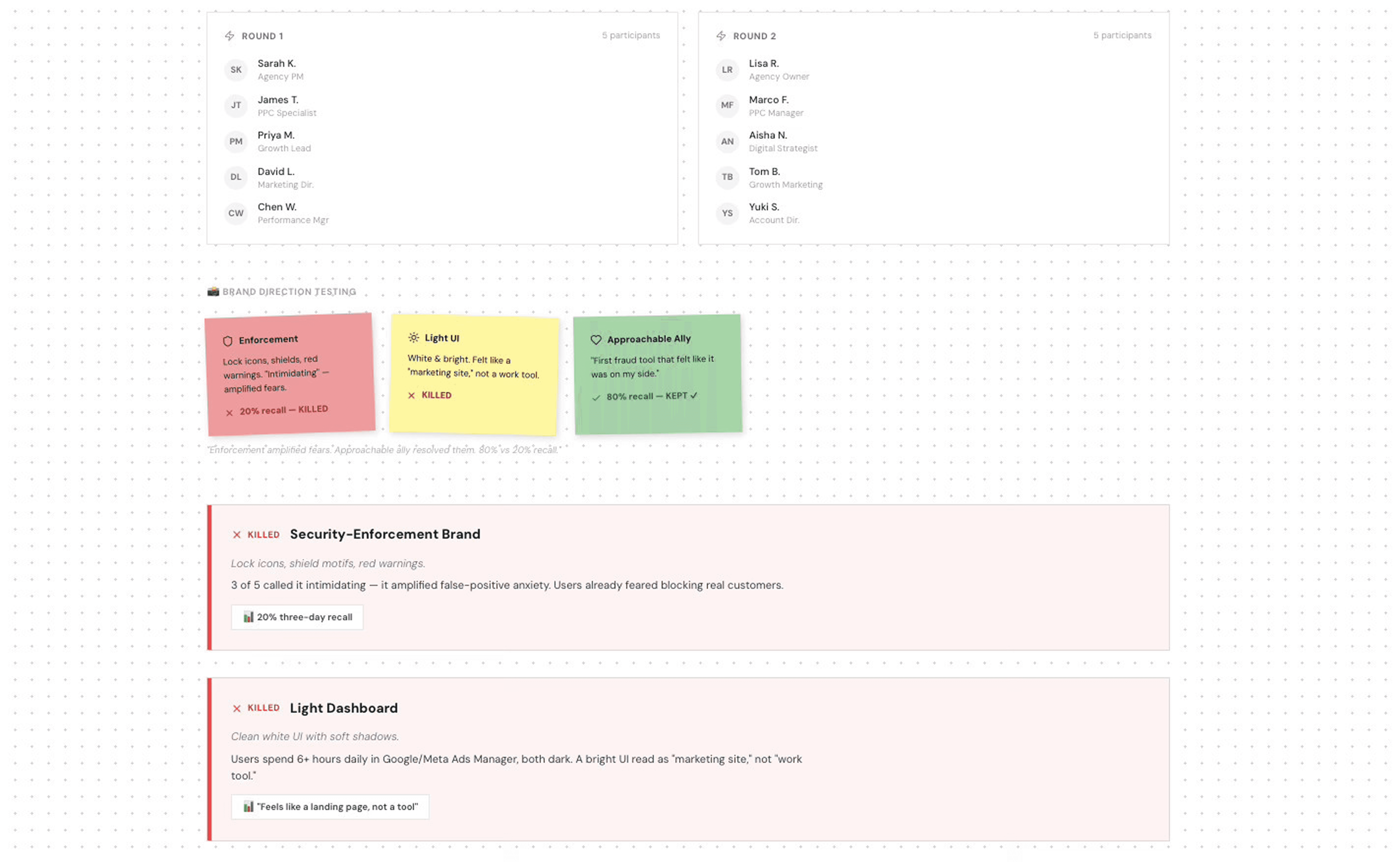
Two rounds of concept testing, five participants each. Security enforcement was killed on day one. Approachable ally won with 80% three day recall the first fraud tool that felt like it was on your side.

Design System
Design System
Token based system built before any screens. Three colour layers brand, semantic signal (safe/warning/fraud/AI), and surface. DM Sans + DM Mono type scale. 24 components with dark variants. 4px spacing grid.
Semantic signals were the most important decision. Green = genuine, amber = suspicious, pink = confirmed fraud, purple = AI insight. The dashboard became scannable without reading a single label.
By week 4, the system was saving roughly 2 hours per screen. On a tight timeline, building it felt risky. Not building it would have been worse inconsistency in a trust product erodes the trust you're trying to build.

Token based system built before any screens
Platform Design
Platform Design
Onboarding: 4-step wizard account, platform connection, pixel install with live verification, first fraud event. The old pixel step had no feedback and 60% abandoned. Adding pixel detected on heartbeat.ua, Verified ✓ before enabling Continue took completion from 40% to 74%. Highest-ROI change in the project.
Dashboard: Hero metric is Total Savings in dollars. Every fraud event shows what was blocked, why, and how much it cost. Users see the system working, not just a number.
Detection rules: Four rule types, each with plain english explanation, live stats, and a toggle. Geo filter off by default I didn't want to block legitimate traffic without explicit intent. Honestly, the geo off state was ambiguous in testing and I shipped it knowing that. First thing I'd fix.

Onboarding completion jumped from 40% to 74% after replacing the single form pixel step with a four step wizard and live verification. The biggest ROI unlock in the project
AI Integration
AI Integration
AI was designed into three touchpoints where rules break down not bolted on at the end. Rules catch what you expect. AI catches what you don't.
Fraud Intelligence Report. User inputs campaign data, Claude produces a risk assessment with scored signals, plain english analysis, and recommended actions. This is what users send to clients as proof of value making it a retention tool, not just detection.
Behavioural Analysis Rule. Runs live alongside standard rules. Catches patterns too subtle for thresholds slow VPN rotations, bots mimicking scroll depth, sophisticated competitor clicking.
Weekly Summary. AI generated narrative of fraud trends, designed to be shareable with clients who don't log into the platform.
Worked closely with engineering on latency we used streaming output for the report so it feels responsive rather than making users wait.

AI embedded at three touchpoints where rules break down .Fraud Intelligence Reports, Behavioural Analysis Rules, and shareable Weekly Summaries built with streaming output so it feels instant, not waiting
Outcomes
Outcomes
Three hypotheses set before design. All confirmed.
3.2× trial sign ups vs previous placeholder page. The conversion rate on the page itself improved, which is the design attributable part. Outreach timing also contributed I am honest about that.
74% onboarding completion up from ~40%. This one I am confident attributing to design. The change was isolated and measured directly.
10K downloads in 90 days ahead of schedule.
600% avg ROI reported by early users, month one. Consistently cited dollar value framing as why they understood the product.
18% of fraud caught by AI only not a design metric, but it validated the AI integration as genuinely useful, not decorative.

Three hypotheses. All confirmed. 3.2× trial signups, 74% onboarding completion, 10K downloads in 90 days, 600% avg ROI reported by early users and 18% of fraud caught by AI only.
Reflection
Reflection
Pixel copy paste is painful on mobile I had rebuild it as a send to developer email flow. Empty states need to be activation moments, not just illustrations. Detection rules needed another testing round. And the #1 user request was "how much did Axios save me total? I had add an All Platforms view.
I had also properly design notification content. A fraud spike alert like 14 suspicious clicks in 30 min $140 at risk is a retention moment that deserves design attention, not an afterthought.


Learnings
Learnings
Research at the start has disproportionate ROI. Two weeks felt slow. It produced the single highest impact insight that drove the biggest metric improvement. Language is a design material. $340.40 protected vs 12% cleaner traffic wasn't copywriting it was the core product decision.
Understanding which fear dominates shapes everything. False positive anxiety determined toggle defaults, hierarchy, control models, and tone. AI earns trust through explanation, not scores. Users engaged with the reasoning, not the number.
More Projects


UI / UX Design
Axios: Building trust in ad-tech brand, platform & zero to one
Axios: Building trust in ad-tech brand, platform & zero to one
Axios: Building trust in ad-tech brand, platform & zero to one
Axios had no brand, no website, no product. I designed everything from identity to a full AI powered fraud protection platform in 8 weeks.
Year :
2025
2025
Industry :
Finance
Finance
Client :
Axios
Axios
Project Duration :
8 Weeks
Introduction
Introduction
Axios had a fraud detection engine that outperformed competitors but no brand, no website, and no product UI. My job was to build everything from identity to a full AI powered platform in 8 weeks, working with a two person engineering team.
Ad tech buyers have been burned by tools that overpromise and show no proof. Every decision in this project had to earn trust before asking for it.
The Gap: I audited ClickCease, TrafficGuard, CHEQ, and Improvely 48 screens mapped. Same pattern everywhere: show a number, say trust us, explain nothing. No competitor made fraud protection feel approachable or gave users real control.
The opportunity wasn't better detection Axios already had that. It was better communication of what the detection was doing, in money terms, with proof users could verify.
Every competitor showed a number and asked for trust. None made fraud protection feel approachable, transparent, or real
Research & Discovery
Research & Discovery
6 user interviews, 94 support tickets analysed, 4 competitive teardowns, and a card sort on terminology. No design until week 3. The founder wanted screens I argued that designing the wrong thing fast costs more. He agreed if I presented clear findings by end of week 2.
What changed everything:
Fear of false positives was bigger than fear of fraud. 3 of 6 users had churned from a previous tool for blocking real customers. This reshaped the entire control model every rule toggleable, every threshold adjustable. Every user defined success in money, not percentages. How much did you save me not what percentage was cleaner. The product's own language was wrong.
31% of support tickets were I don't know if it's working. Users couldn't tell if their tool was active. This became the core principle: always show proof. Setup abandonment was the #1 churn driver. 18 minute average time to value across competitors. Users who didn't see value in session one didn't return.
8 interviews, 94 support tickets, 4 teardowns. Fear of false positives outweighed fear of fraud — and 31% of tickets were users asking if the tool was even working.
Design Principles- from research to rules
Design Principles- from research to rules
Four rules every screen had to pass, signed off before any visual work:
Always show proof: no silent blocking, every action visible. Translate to money: "$340.40 protected" not "21 clicks blocked." User stays in control : every rule toggleable, product advises, user decides. First value in 3 minutes : if it doesn't land in session one, there's no session two.
Design Decisions
Design Decisions
Two rounds of concept testing, 5 participants each.
Killed: Security-enforcement brand. Lock icons, shield motifs, red warnings. 3 of 5 called it intimidating, it amplified false positive anxiety. 20% three day recall.
Killed: Light dashboard. Users spend 6+ hours daily in Google/Meta Ads Manager, both dark. A bright UI read as marketing site, not work tool.
Kept: Approachable ally brand. Warm but precise, protective not punitive. 80% three day recall. First fraud tool that felt like it was on my side.
Pivoted: Dollar amounts lead. Users skipped 12% cleaner traffic. One participant leaned forward at $340.40 protected this week.
Kept: 4 step wizard. Single form: 40% completion. Wizard with live pixel verification: 100% in testing. Biggest single unlock.
Two rounds of concept testing, five participants each. Security enforcement was killed on day one. Approachable ally won with 80% three day recall the first fraud tool that felt like it was on your side.
Design System
Design System
Token based system built before any screens. Three colour layers brand, semantic signal (safe/warning/fraud/AI), and surface. DM Sans + DM Mono type scale. 24 components with dark variants. 4px spacing grid.
Semantic signals were the most important decision. Green = genuine, amber = suspicious, pink = confirmed fraud, purple = AI insight. The dashboard became scannable without reading a single label.
By week 4, the system was saving roughly 2 hours per screen. On a tight timeline, building it felt risky. Not building it would have been worse inconsistency in a trust product erodes the trust you're trying to build.
Token based system built before any screens
Platform Design
Platform Design
Onboarding: 4-step wizard account, platform connection, pixel install with live verification, first fraud event. The old pixel step had no feedback and 60% abandoned. Adding pixel detected on heartbeat.ua, Verified ✓ before enabling Continue took completion from 40% to 74%. Highest-ROI change in the project.
Dashboard: Hero metric is Total Savings in dollars. Every fraud event shows what was blocked, why, and how much it cost. Users see the system working, not just a number.
Detection rules: Four rule types, each with plain english explanation, live stats, and a toggle. Geo filter off by default I didn't want to block legitimate traffic without explicit intent. Honestly, the geo off state was ambiguous in testing and I shipped it knowing that. First thing I'd fix.
Onboarding completion jumped from 40% to 74% after replacing the single form pixel step with a four step wizard and live verification. The biggest ROI unlock in the project
AI Integration
AI Integration
AI was designed into three touchpoints where rules break down not bolted on at the end. Rules catch what you expect. AI catches what you don't.
Fraud Intelligence Report. User inputs campaign data, Claude produces a risk assessment with scored signals, plain english analysis, and recommended actions. This is what users send to clients as proof of value making it a retention tool, not just detection.
Behavioural Analysis Rule. Runs live alongside standard rules. Catches patterns too subtle for thresholds slow VPN rotations, bots mimicking scroll depth, sophisticated competitor clicking.
Weekly Summary. AI generated narrative of fraud trends, designed to be shareable with clients who don't log into the platform.
Worked closely with engineering on latency we used streaming output for the report so it feels responsive rather than making users wait.
AI embedded at three touchpoints where rules break down .Fraud Intelligence Reports, Behavioural Analysis Rules, and shareable Weekly Summaries built with streaming output so it feels instant, not waiting
Outcomes
Outcomes
Three hypotheses set before design. All confirmed.
3.2× trial sign ups vs previous placeholder page. The conversion rate on the page itself improved, which is the design attributable part. Outreach timing also contributed I am honest about that.
74% onboarding completion up from ~40%. This one I am confident attributing to design. The change was isolated and measured directly.
10K downloads in 90 days ahead of schedule.
600% avg ROI reported by early users, month one. Consistently cited dollar value framing as why they understood the product.
18% of fraud caught by AI only not a design metric, but it validated the AI integration as genuinely useful, not decorative.
Three hypotheses. All confirmed. 3.2× trial signups, 74% onboarding completion, 10K downloads in 90 days, 600% avg ROI reported by early users and 18% of fraud caught by AI only.
Reflection
Reflection
Pixel copy paste is painful on mobile I had rebuild it as a send to developer email flow. Empty states need to be activation moments, not just illustrations. Detection rules needed another testing round. And the #1 user request was "how much did Axios save me total? I had add an All Platforms view.
I had also properly design notification content. A fraud spike alert like 14 suspicious clicks in 30 min $140 at risk is a retention moment that deserves design attention, not an afterthought.
Learnings
Learnings
Research at the start has disproportionate ROI. Two weeks felt slow. It produced the single highest impact insight that drove the biggest metric improvement. Language is a design material. $340.40 protected vs 12% cleaner traffic wasn't copywriting it was the core product decision.
Understanding which fear dominates shapes everything. False positive anxiety determined toggle defaults, hierarchy, control models, and tone. AI earns trust through explanation, not scores. Users engaged with the reasoning, not the number.
More Projects
UI / UX Design
Axios: Building trust in ad-tech brand, platform & zero to one
Axios: Building trust in ad-tech brand, platform & zero to one
Axios: Building trust in ad-tech brand, platform & zero to one
Axios had no brand, no website, no product. I designed everything from identity to a full AI powered fraud protection platform in 8 weeks.
Year :
2025
2025
Industry :
Finance
Finance
Client :
Axios
Axios
Project Duration :
8 Weeks
Introduction
Introduction
Axios had a fraud detection engine that outperformed competitors but no brand, no website, and no product UI. My job was to build everything from identity to a full AI powered platform in 8 weeks, working with a two person engineering team.
Ad tech buyers have been burned by tools that overpromise and show no proof. Every decision in this project had to earn trust before asking for it.
The Gap: I audited ClickCease, TrafficGuard, CHEQ, and Improvely 48 screens mapped. Same pattern everywhere: show a number, say trust us, explain nothing. No competitor made fraud protection feel approachable or gave users real control.
The opportunity wasn't better detection Axios already had that. It was better communication of what the detection was doing, in money terms, with proof users could verify.
Every competitor showed a number and asked for trust. None made fraud protection feel approachable, transparent, or real
Research & Discovery
Research & Discovery
6 user interviews, 94 support tickets analysed, 4 competitive teardowns, and a card sort on terminology. No design until week 3. The founder wanted screens I argued that designing the wrong thing fast costs more. He agreed if I presented clear findings by end of week 2.
What changed everything:
Fear of false positives was bigger than fear of fraud. 3 of 6 users had churned from a previous tool for blocking real customers. This reshaped the entire control model every rule toggleable, every threshold adjustable. Every user defined success in money, not percentages. How much did you save me not what percentage was cleaner. The product's own language was wrong.
31% of support tickets were I don't know if it's working. Users couldn't tell if their tool was active. This became the core principle: always show proof. Setup abandonment was the #1 churn driver. 18 minute average time to value across competitors. Users who didn't see value in session one didn't return.
8 interviews, 94 support tickets, 4 teardowns. Fear of false positives outweighed fear of fraud — and 31% of tickets were users asking if the tool was even working.
Design Principles- from research to rules
Design Principles- from research to rules
Four rules every screen had to pass, signed off before any visual work:
Always show proof: no silent blocking, every action visible. Translate to money: "$340.40 protected" not "21 clicks blocked." User stays in control : every rule toggleable, product advises, user decides. First value in 3 minutes : if it doesn't land in session one, there's no session two.
Design Decisions
Design Decisions
Two rounds of concept testing, 5 participants each.
Killed: Security-enforcement brand. Lock icons, shield motifs, red warnings. 3 of 5 called it intimidating, it amplified false positive anxiety. 20% three day recall.
Killed: Light dashboard. Users spend 6+ hours daily in Google/Meta Ads Manager, both dark. A bright UI read as marketing site, not work tool.
Kept: Approachable ally brand. Warm but precise, protective not punitive. 80% three day recall. First fraud tool that felt like it was on my side.
Pivoted: Dollar amounts lead. Users skipped 12% cleaner traffic. One participant leaned forward at $340.40 protected this week.
Kept: 4 step wizard. Single form: 40% completion. Wizard with live pixel verification: 100% in testing. Biggest single unlock.
Two rounds of concept testing, five participants each. Security enforcement was killed on day one. Approachable ally won with 80% three day recall the first fraud tool that felt like it was on your side.
Design System
Design System
Token based system built before any screens. Three colour layers brand, semantic signal (safe/warning/fraud/AI), and surface. DM Sans + DM Mono type scale. 24 components with dark variants. 4px spacing grid.
Semantic signals were the most important decision. Green = genuine, amber = suspicious, pink = confirmed fraud, purple = AI insight. The dashboard became scannable without reading a single label.
By week 4, the system was saving roughly 2 hours per screen. On a tight timeline, building it felt risky. Not building it would have been worse inconsistency in a trust product erodes the trust you're trying to build.
Token based system built before any screens
Platform Design
Platform Design
Onboarding: 4-step wizard account, platform connection, pixel install with live verification, first fraud event. The old pixel step had no feedback and 60% abandoned. Adding pixel detected on heartbeat.ua, Verified ✓ before enabling Continue took completion from 40% to 74%. Highest-ROI change in the project.
Dashboard: Hero metric is Total Savings in dollars. Every fraud event shows what was blocked, why, and how much it cost. Users see the system working, not just a number.
Detection rules: Four rule types, each with plain english explanation, live stats, and a toggle. Geo filter off by default I didn't want to block legitimate traffic without explicit intent. Honestly, the geo off state was ambiguous in testing and I shipped it knowing that. First thing I'd fix.
Onboarding completion jumped from 40% to 74% after replacing the single form pixel step with a four step wizard and live verification. The biggest ROI unlock in the project
AI Integration
AI Integration
AI was designed into three touchpoints where rules break down not bolted on at the end. Rules catch what you expect. AI catches what you don't.
Fraud Intelligence Report. User inputs campaign data, Claude produces a risk assessment with scored signals, plain english analysis, and recommended actions. This is what users send to clients as proof of value making it a retention tool, not just detection.
Behavioural Analysis Rule. Runs live alongside standard rules. Catches patterns too subtle for thresholds slow VPN rotations, bots mimicking scroll depth, sophisticated competitor clicking.
Weekly Summary. AI generated narrative of fraud trends, designed to be shareable with clients who don't log into the platform.
Worked closely with engineering on latency we used streaming output for the report so it feels responsive rather than making users wait.
AI embedded at three touchpoints where rules break down .Fraud Intelligence Reports, Behavioural Analysis Rules, and shareable Weekly Summaries built with streaming output so it feels instant, not waiting
Outcomes
Outcomes
Three hypotheses set before design. All confirmed.
3.2× trial sign ups vs previous placeholder page. The conversion rate on the page itself improved, which is the design attributable part. Outreach timing also contributed I am honest about that.
74% onboarding completion up from ~40%. This one I am confident attributing to design. The change was isolated and measured directly.
10K downloads in 90 days ahead of schedule.
600% avg ROI reported by early users, month one. Consistently cited dollar value framing as why they understood the product.
18% of fraud caught by AI only not a design metric, but it validated the AI integration as genuinely useful, not decorative.
Three hypotheses. All confirmed. 3.2× trial signups, 74% onboarding completion, 10K downloads in 90 days, 600% avg ROI reported by early users and 18% of fraud caught by AI only.
Reflection
Reflection
Pixel copy paste is painful on mobile I had rebuild it as a send to developer email flow. Empty states need to be activation moments, not just illustrations. Detection rules needed another testing round. And the #1 user request was "how much did Axios save me total? I had add an All Platforms view.
I had also properly design notification content. A fraud spike alert like 14 suspicious clicks in 30 min $140 at risk is a retention moment that deserves design attention, not an afterthought.
Learnings
Learnings
Research at the start has disproportionate ROI. Two weeks felt slow. It produced the single highest impact insight that drove the biggest metric improvement. Language is a design material. $340.40 protected vs 12% cleaner traffic wasn't copywriting it was the core product decision.
Understanding which fear dominates shapes everything. False positive anxiety determined toggle defaults, hierarchy, control models, and tone. AI earns trust through explanation, not scores. Users engaged with the reasoning, not the number.