UI / UX Design
Tradeteq's Design System
Tradeteq's Design System
Tradeteq's Design System
Establishing a unified design language to support a fast-scaling fintech product
Year :
2024
2024
Industry :
Finance
Finance
Client :
Tradeteq
Tradeteq
Project Duration :
6 months

Introduction
Introduction
Tradeteq is a London based trade finance platform connecting institutional investors with trade finance assets a space where trust, clarity, and precision aren't just nice to have, they're fundamental to the business.When I joined as the product designer, the product had grown fast. It was the right moment to build a design foundation that could scale alongside it. I had full autonomy to set the visual and UX direction, and I used that to create something the whole team could build on, not just design from.
Over six months, I conceived, built, and shipped a complete design system from the ground up. One that didn't just organise pixels, but meaningfully changed how design and engineering worked together at Tradeteq.

The full Figma library tokens, typography, grid, and component documentation in one place.
Research & Discovery
Research & Discovery
Without a formalised system, design decisions were being made feature by feature rather than from a central reference. Colour values, button styles, and spacing choices lived in individual files rather than a shared library. This was manageable at smaller scale, but as the team and product grew, the lack of a single source of truth was creating friction on both sides of the design engineering relationship.
How can I create a design system that is simple, scalable, and understandable by both designers and developers while reducing the friction of rapid growth?
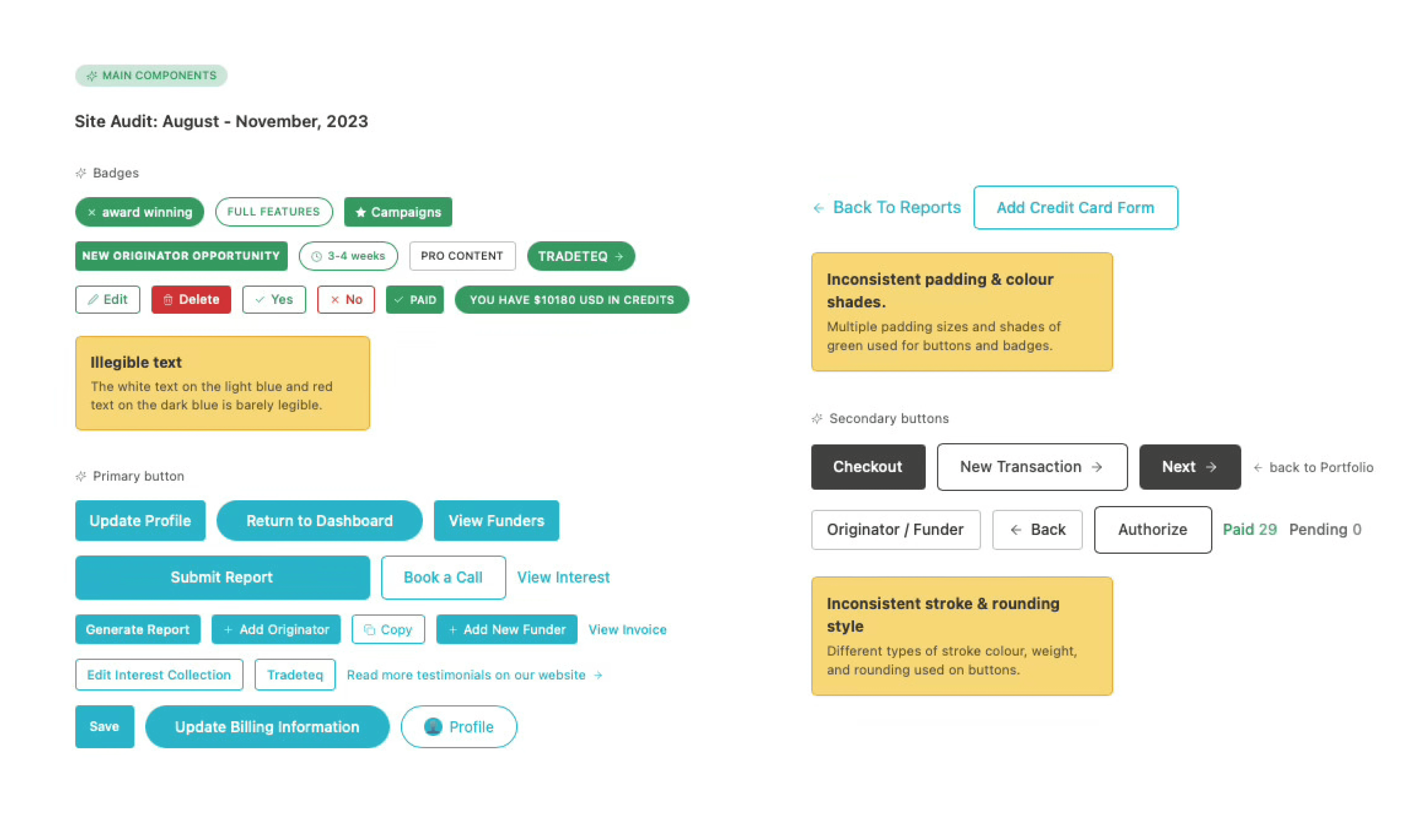
Site audit August November 2023. Inconsistent padding, colour shades, stroke weights, and rounding across badges and buttons alone.
Discovery - The Problem of "Too Many Variants"
Discovery - The Problem of "Too Many Variants"
I began with a thorough audit of the existing product. This gave me a clear picture of what components existed, how many variants had accumulated over time, and where the biggest opportunities for consolidation were. The audit surfaced a wide range of component variations badges, inputs, buttons many of which had evolved independently across different features rather than from a shared starting point.
This research shaped the system's priorities. I knew that simply creating a new Figma file wouldn't be enough. I needed to build something that would actively reduce ambiguity for both designers and developers, and that could scale as the product and team grew.
Not everything could be built at once, so I had to decide where to start. I prioritised by two things: how often a component appeared across the product, and how inconsistent it currently was. Badges and buttons came first not because they were the most interesting to design, but because they'd give the team the fastest return on trust in the system. Tokens came before components, because without a shared vocabulary at the foundation, any component I built would still require translation between design and code.
Strategic Approach: Treating the Design System as a Product
I focused on three specific internal personas to guide every decision in the system. Understanding what each person actually needed not just what they said they needed made it possible to build something that got used rather than admired and ignored.
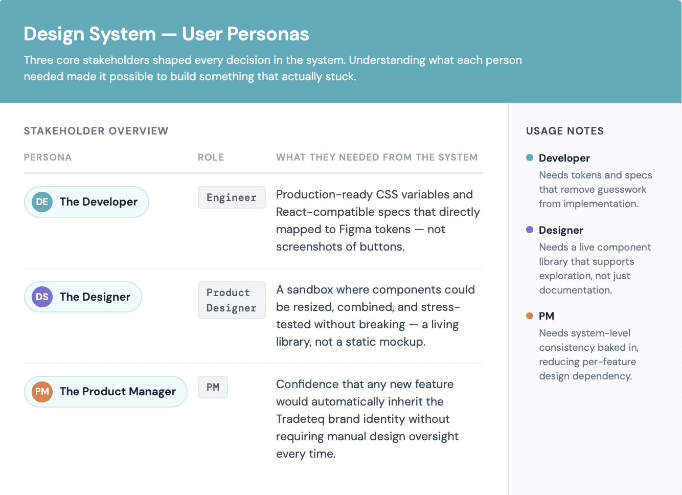
Roadmap: Survey , Web analysis
Ideation & Development
Ideation & Development
Bridging the Gap
The system was built on the Atomic Design philosophy. I collaborated closely with the frontend lead to move beyond static images. We integrated design tokens and code snippets directly into the Figma environment so that our design "atoms" colours, typography, spacing were identical to the variables used in the React repository. Myself and engineers were referencing the same vocabulary without a translation layer between us.

Early ideation mapping the build phases and open questions before a single component was created.

Early component exploration. Establishing interaction patterns before committing to final designs.
Ecosystem "How it Works"
Ecosystem "How it Works"
The system was architected in layers, each one dependent on the last. Tokens sat at the base a single source of truth for colour, typography, spacing, shadow, and border radius. Because every value was named semantically and mapped directly to CSS variables in the codebase, a change at the token level cascaded through the entire product automatically. Components were built on top of that token foundation, which meant visual consistency was structural rather than a matter of individual judgment. The grid and spacing system gave both teams a shared spatial language layout decisions became faster because the rules were already agreed upon.
The layer that tied it all together was documentation. Every component carried notes on intended use, edge cases, and implementation guidance written specifically for engineers. The system wasn't just a Figma library it was a reference tool that made it easy to do things the right way the first time.
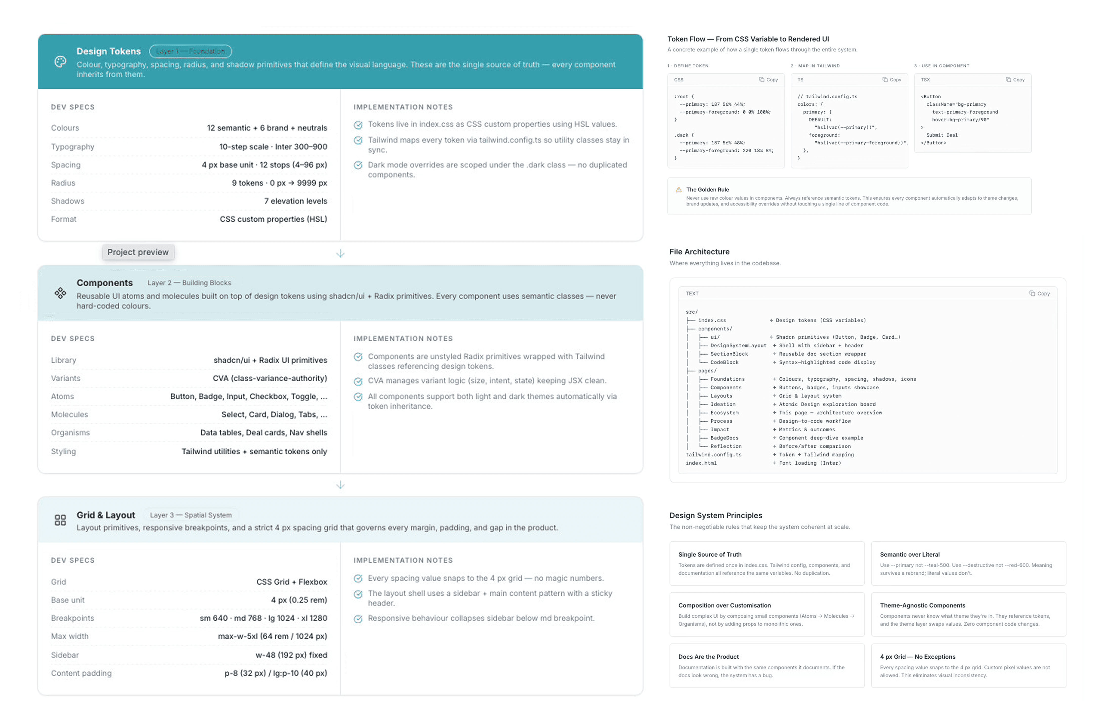
Every colour token named semantically and mapped directly to a CSS variable. One change at token level, cascades everywhere.
Process & Collaboration
Process & Collaboration
Working Closely with Engineering
Collaboration was built into the process from day one. Implementation approaches, component states, and edge cases were aligned with engineering as decisions were made not after. The result was a genuine feedback loop where developers shaped the system as much as I did, making it co owned rather than handed over.
Being Your Own Senior
Without a design lead to challenge my decisions, I built that pressure into the process myself. Every major call token naming, component architecture, what to consolidate was documented with a reason before I built it. If I couldn't write a clear rationale, that was a sign the decision wasn't ready yet.

Design to code pipeline: six stages from Figma decision to shipped component, with direct layer name to Tailwind class mapping
Testing and Future Growth
Testing and Future Growth
Faster Handoff the most immediate change was in handoff. Developers stopped raising clarification comments mid sprint because the answer was already in the documentation hover states, spacing values, edge cases, all written next to the component. That back and forth had been a quiet tax on every sprint that nobody was formally tracking until it disappeared.
↓ Faster : Design to dev handoff time Developers stopped chasing design decisions mid sprint. The answer was already in the docs.
1 Unified : Figma library across the product One library replaced a folder of disconnected files. Every team member referencing the same source.
6 mo.: Full system shipped end to end Tokens, components, grid, and documentation conceived, prioritised, built, and adopted within a single product cycle.
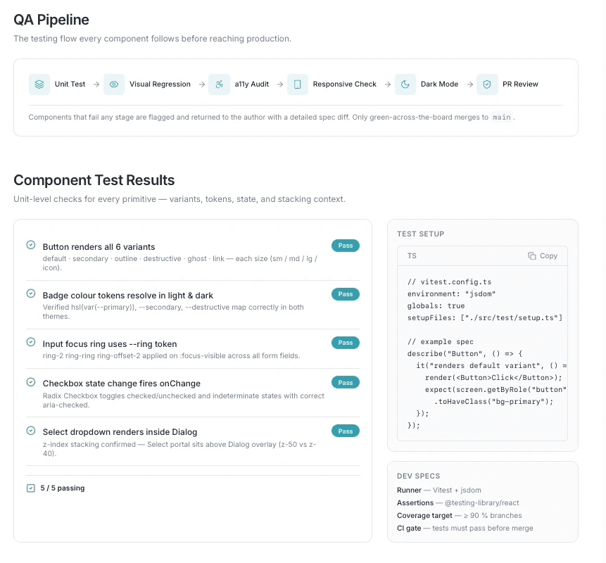
QA pipeline with comprehensive testing: unit tests, visual regression, a11y audits, responsive checks, and dark mode validation
A Single Source of Truth
The team now had one shared Figma library as the definitive reference point for the entire product. New features inherited brand identity automatically, giving the team confidence that the product would look and feel like Tradeteq regardless of who built it or when.
Reduced Cognitive Load for the Team
Designers could work faster because component decisions had already been made. Product managers had confidence that new builds would look like Tradeteq. Developers had the context they needed without needing to interrupt the design workflow. Collectively, this freed the team to focus on harder, more interesting problems.

Theme token validation across light and dark modes, plus visual regression workflow catching unintended changes before production.
Reflection
Reflection
This project taught me that a design system is never really a design artifact it's an organisational one. The tokens, components, and documentation were means to an end. The real goal was to change how two teams communicated and trusted each other.
Working as the sole designer on a project of this scale pushed me to be more rigorous, more deliberate, and more collaborative than I might have been with a larger team around me. I had to make consequential decisions without a safety net, which meant building systems for accountability directly into the work itself.

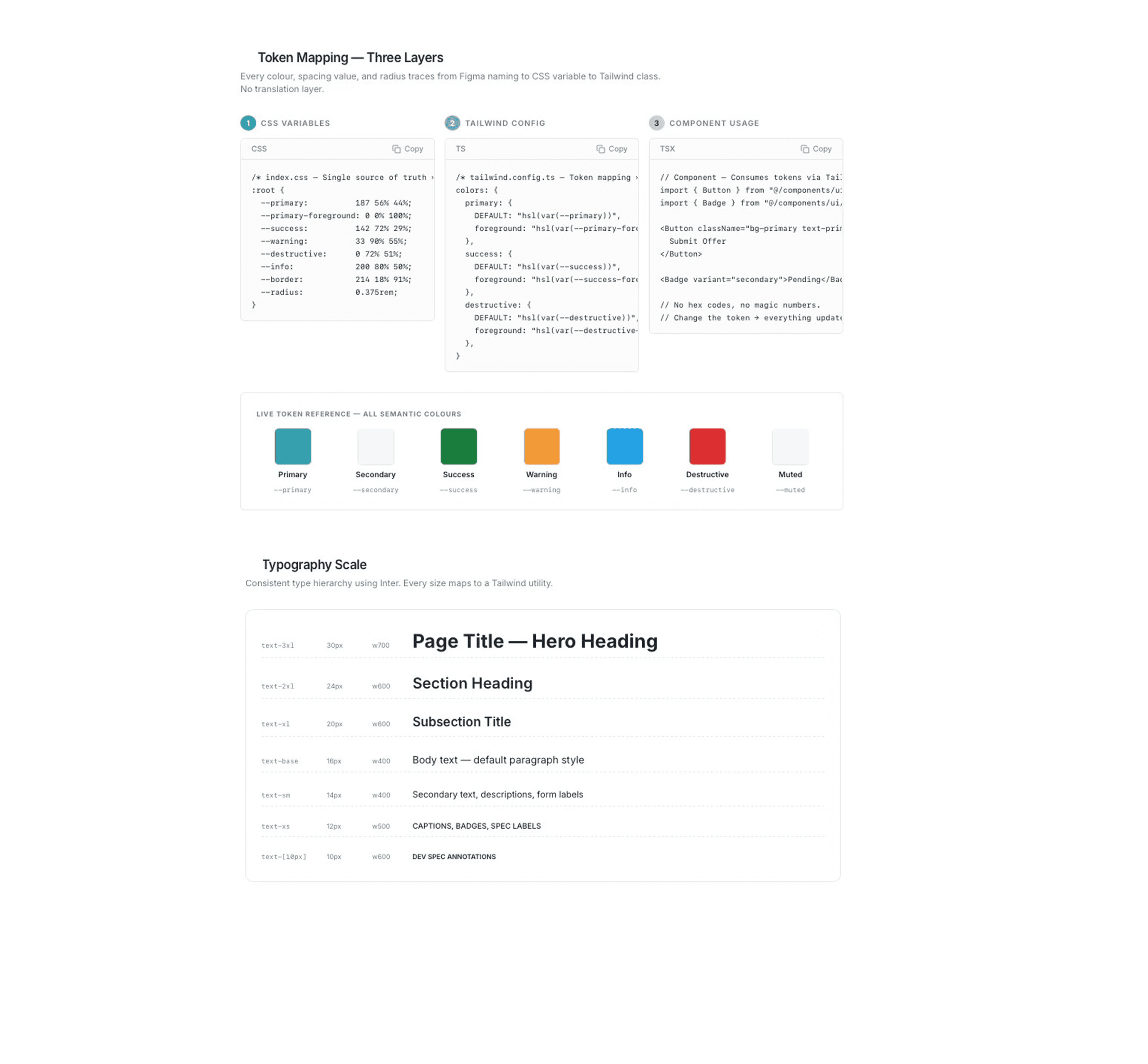
Three layer token architecture: CSS variables → Tailwind config → component usage, with semantic color system and typography scale
Component variant matrix showing all button and badge states with full documentation and specifications
Outcomes
Outcomes
The one thing I'd do differently is set a baseline before building clarification comments per sprint, time spent on handoff reviews, UI bugs raised per release. I was tracking outputs the whole time, but having those numbers upfront would have let me show the actual delta rather than just talk about it.
The best design system isn't the most sophisticated one, it's the one the whole team actually uses.
More Projects


UI / UX Design
Tradeteq's Design System
Tradeteq's Design System
Tradeteq's Design System
Establishing a unified design language to support a fast-scaling fintech product
Year :
2024
2024
Industry :
Finance
Finance
Client :
Tradeteq
Tradeteq
Project Duration :
6 months
Introduction
Introduction
Tradeteq is a London based trade finance platform connecting institutional investors with trade finance assets a space where trust, clarity, and precision aren't just nice to have, they're fundamental to the business.When I joined as the product designer, the product had grown fast. It was the right moment to build a design foundation that could scale alongside it. I had full autonomy to set the visual and UX direction, and I used that to create something the whole team could build on, not just design from.
Over six months, I conceived, built, and shipped a complete design system from the ground up. One that didn't just organise pixels, but meaningfully changed how design and engineering worked together at Tradeteq.
The full Figma library tokens, typography, grid, and component documentation in one place.
Research & Discovery
Research & Discovery
Without a formalised system, design decisions were being made feature by feature rather than from a central reference. Colour values, button styles, and spacing choices lived in individual files rather than a shared library. This was manageable at smaller scale, but as the team and product grew, the lack of a single source of truth was creating friction on both sides of the design engineering relationship.
How can I create a design system that is simple, scalable, and understandable by both designers and developers while reducing the friction of rapid growth?
Site audit August November 2023. Inconsistent padding, colour shades, stroke weights, and rounding across badges and buttons alone.
Discovery - The Problem of "Too Many Variants"
Discovery - The Problem of "Too Many Variants"
I began with a thorough audit of the existing product. This gave me a clear picture of what components existed, how many variants had accumulated over time, and where the biggest opportunities for consolidation were. The audit surfaced a wide range of component variations badges, inputs, buttons many of which had evolved independently across different features rather than from a shared starting point.
This research shaped the system's priorities. I knew that simply creating a new Figma file wouldn't be enough. I needed to build something that would actively reduce ambiguity for both designers and developers, and that could scale as the product and team grew.
Not everything could be built at once, so I had to decide where to start. I prioritised by two things: how often a component appeared across the product, and how inconsistent it currently was. Badges and buttons came first not because they were the most interesting to design, but because they'd give the team the fastest return on trust in the system. Tokens came before components, because without a shared vocabulary at the foundation, any component I built would still require translation between design and code.
Strategic Approach: Treating the Design System as a Product
I focused on three specific internal personas to guide every decision in the system. Understanding what each person actually needed not just what they said they needed made it possible to build something that got used rather than admired and ignored.
Roadmap: Survey , Web analysis
Ideation & Development
Ideation & Development
Bridging the Gap
The system was built on the Atomic Design philosophy. I collaborated closely with the frontend lead to move beyond static images. We integrated design tokens and code snippets directly into the Figma environment so that our design "atoms" colours, typography, spacing were identical to the variables used in the React repository. Myself and engineers were referencing the same vocabulary without a translation layer between us.
Early ideation mapping the build phases and open questions before a single component was created.
Early component exploration. Establishing interaction patterns before committing to final designs.
Ecosystem "How it Works"
Ecosystem "How it Works"
The system was architected in layers, each one dependent on the last. Tokens sat at the base a single source of truth for colour, typography, spacing, shadow, and border radius. Because every value was named semantically and mapped directly to CSS variables in the codebase, a change at the token level cascaded through the entire product automatically. Components were built on top of that token foundation, which meant visual consistency was structural rather than a matter of individual judgment. The grid and spacing system gave both teams a shared spatial language layout decisions became faster because the rules were already agreed upon.
The layer that tied it all together was documentation. Every component carried notes on intended use, edge cases, and implementation guidance written specifically for engineers. The system wasn't just a Figma library it was a reference tool that made it easy to do things the right way the first time.
Every colour token named semantically and mapped directly to a CSS variable. One change at token level, cascades everywhere.
Process & Collaboration
Process & Collaboration
Working Closely with Engineering
Collaboration was built into the process from day one. Implementation approaches, component states, and edge cases were aligned with engineering as decisions were made not after. The result was a genuine feedback loop where developers shaped the system as much as I did, making it co owned rather than handed over.
Being Your Own Senior
Without a design lead to challenge my decisions, I built that pressure into the process myself. Every major call token naming, component architecture, what to consolidate was documented with a reason before I built it. If I couldn't write a clear rationale, that was a sign the decision wasn't ready yet.
Design to code pipeline: six stages from Figma decision to shipped component, with direct layer name to Tailwind class mapping
Testing and Future Growth
Testing and Future Growth
Faster Handoff the most immediate change was in handoff. Developers stopped raising clarification comments mid sprint because the answer was already in the documentation hover states, spacing values, edge cases, all written next to the component. That back and forth had been a quiet tax on every sprint that nobody was formally tracking until it disappeared.
↓ Faster : Design to dev handoff time Developers stopped chasing design decisions mid sprint. The answer was already in the docs.
1 Unified : Figma library across the product One library replaced a folder of disconnected files. Every team member referencing the same source.
6 mo.: Full system shipped end to end Tokens, components, grid, and documentation conceived, prioritised, built, and adopted within a single product cycle.
QA pipeline with comprehensive testing: unit tests, visual regression, a11y audits, responsive checks, and dark mode validation
A Single Source of Truth
The team now had one shared Figma library as the definitive reference point for the entire product. New features inherited brand identity automatically, giving the team confidence that the product would look and feel like Tradeteq regardless of who built it or when.
Reduced Cognitive Load for the Team
Designers could work faster because component decisions had already been made. Product managers had confidence that new builds would look like Tradeteq. Developers had the context they needed without needing to interrupt the design workflow. Collectively, this freed the team to focus on harder, more interesting problems.
Theme token validation across light and dark modes, plus visual regression workflow catching unintended changes before production.
Reflection
Reflection
This project taught me that a design system is never really a design artifact it's an organisational one. The tokens, components, and documentation were means to an end. The real goal was to change how two teams communicated and trusted each other.
Working as the sole designer on a project of this scale pushed me to be more rigorous, more deliberate, and more collaborative than I might have been with a larger team around me. I had to make consequential decisions without a safety net, which meant building systems for accountability directly into the work itself.
Three layer token architecture: CSS variables → Tailwind config → component usage, with semantic color system and typography scale
Component variant matrix showing all button and badge states with full documentation and specifications
Outcomes
Outcomes
The one thing I'd do differently is set a baseline before building clarification comments per sprint, time spent on handoff reviews, UI bugs raised per release. I was tracking outputs the whole time, but having those numbers upfront would have let me show the actual delta rather than just talk about it.
The best design system isn't the most sophisticated one, it's the one the whole team actually uses.
More Projects
UI / UX Design
Tradeteq's Design System
Tradeteq's Design System
Tradeteq's Design System
Establishing a unified design language to support a fast-scaling fintech product
Year :
2024
2024
Industry :
Finance
Finance
Client :
Tradeteq
Tradeteq
Project Duration :
6 months
Introduction
Introduction
Tradeteq is a London based trade finance platform connecting institutional investors with trade finance assets a space where trust, clarity, and precision aren't just nice to have, they're fundamental to the business.When I joined as the product designer, the product had grown fast. It was the right moment to build a design foundation that could scale alongside it. I had full autonomy to set the visual and UX direction, and I used that to create something the whole team could build on, not just design from.
Over six months, I conceived, built, and shipped a complete design system from the ground up. One that didn't just organise pixels, but meaningfully changed how design and engineering worked together at Tradeteq.
The full Figma library tokens, typography, grid, and component documentation in one place.
Research & Discovery
Research & Discovery
Without a formalised system, design decisions were being made feature by feature rather than from a central reference. Colour values, button styles, and spacing choices lived in individual files rather than a shared library. This was manageable at smaller scale, but as the team and product grew, the lack of a single source of truth was creating friction on both sides of the design engineering relationship.
How can I create a design system that is simple, scalable, and understandable by both designers and developers while reducing the friction of rapid growth?
Site audit August November 2023. Inconsistent padding, colour shades, stroke weights, and rounding across badges and buttons alone.
Discovery - The Problem of "Too Many Variants"
Discovery - The Problem of "Too Many Variants"
I began with a thorough audit of the existing product. This gave me a clear picture of what components existed, how many variants had accumulated over time, and where the biggest opportunities for consolidation were. The audit surfaced a wide range of component variations badges, inputs, buttons many of which had evolved independently across different features rather than from a shared starting point.
This research shaped the system's priorities. I knew that simply creating a new Figma file wouldn't be enough. I needed to build something that would actively reduce ambiguity for both designers and developers, and that could scale as the product and team grew.
Not everything could be built at once, so I had to decide where to start. I prioritised by two things: how often a component appeared across the product, and how inconsistent it currently was. Badges and buttons came first not because they were the most interesting to design, but because they'd give the team the fastest return on trust in the system. Tokens came before components, because without a shared vocabulary at the foundation, any component I built would still require translation between design and code.
Strategic Approach: Treating the Design System as a Product
I focused on three specific internal personas to guide every decision in the system. Understanding what each person actually needed not just what they said they needed made it possible to build something that got used rather than admired and ignored.
Roadmap: Survey , Web analysis
Ideation & Development
Ideation & Development
Bridging the Gap
The system was built on the Atomic Design philosophy. I collaborated closely with the frontend lead to move beyond static images. We integrated design tokens and code snippets directly into the Figma environment so that our design "atoms" colours, typography, spacing were identical to the variables used in the React repository. Myself and engineers were referencing the same vocabulary without a translation layer between us.
Early ideation mapping the build phases and open questions before a single component was created.
Early component exploration. Establishing interaction patterns before committing to final designs.
Ecosystem "How it Works"
Ecosystem "How it Works"
The system was architected in layers, each one dependent on the last. Tokens sat at the base a single source of truth for colour, typography, spacing, shadow, and border radius. Because every value was named semantically and mapped directly to CSS variables in the codebase, a change at the token level cascaded through the entire product automatically. Components were built on top of that token foundation, which meant visual consistency was structural rather than a matter of individual judgment. The grid and spacing system gave both teams a shared spatial language layout decisions became faster because the rules were already agreed upon.
The layer that tied it all together was documentation. Every component carried notes on intended use, edge cases, and implementation guidance written specifically for engineers. The system wasn't just a Figma library it was a reference tool that made it easy to do things the right way the first time.
Every colour token named semantically and mapped directly to a CSS variable. One change at token level, cascades everywhere.
Process & Collaboration
Process & Collaboration
Working Closely with Engineering
Collaboration was built into the process from day one. Implementation approaches, component states, and edge cases were aligned with engineering as decisions were made not after. The result was a genuine feedback loop where developers shaped the system as much as I did, making it co owned rather than handed over.
Being Your Own Senior
Without a design lead to challenge my decisions, I built that pressure into the process myself. Every major call token naming, component architecture, what to consolidate was documented with a reason before I built it. If I couldn't write a clear rationale, that was a sign the decision wasn't ready yet.
Design to code pipeline: six stages from Figma decision to shipped component, with direct layer name to Tailwind class mapping
Testing and Future Growth
Testing and Future Growth
Faster Handoff the most immediate change was in handoff. Developers stopped raising clarification comments mid sprint because the answer was already in the documentation hover states, spacing values, edge cases, all written next to the component. That back and forth had been a quiet tax on every sprint that nobody was formally tracking until it disappeared.
↓ Faster : Design to dev handoff time Developers stopped chasing design decisions mid sprint. The answer was already in the docs.
1 Unified : Figma library across the product One library replaced a folder of disconnected files. Every team member referencing the same source.
6 mo.: Full system shipped end to end Tokens, components, grid, and documentation conceived, prioritised, built, and adopted within a single product cycle.
QA pipeline with comprehensive testing: unit tests, visual regression, a11y audits, responsive checks, and dark mode validation
A Single Source of Truth
The team now had one shared Figma library as the definitive reference point for the entire product. New features inherited brand identity automatically, giving the team confidence that the product would look and feel like Tradeteq regardless of who built it or when.
Reduced Cognitive Load for the Team
Designers could work faster because component decisions had already been made. Product managers had confidence that new builds would look like Tradeteq. Developers had the context they needed without needing to interrupt the design workflow. Collectively, this freed the team to focus on harder, more interesting problems.
Theme token validation across light and dark modes, plus visual regression workflow catching unintended changes before production.
Reflection
Reflection
This project taught me that a design system is never really a design artifact it's an organisational one. The tokens, components, and documentation were means to an end. The real goal was to change how two teams communicated and trusted each other.
Working as the sole designer on a project of this scale pushed me to be more rigorous, more deliberate, and more collaborative than I might have been with a larger team around me. I had to make consequential decisions without a safety net, which meant building systems for accountability directly into the work itself.
Three layer token architecture: CSS variables → Tailwind config → component usage, with semantic color system and typography scale
Component variant matrix showing all button and badge states with full documentation and specifications
Outcomes
Outcomes
The one thing I'd do differently is set a baseline before building clarification comments per sprint, time spent on handoff reviews, UI bugs raised per release. I was tracking outputs the whole time, but having those numbers upfront would have let me show the actual delta rather than just talk about it.
The best design system isn't the most sophisticated one, it's the one the whole team actually uses.