UI / UX Design
Designing a Unified Corporate Finance Platform for Trade Finance Operations
Designing a Unified Corporate Finance Platform for Trade Finance Operations
Designing a Unified Corporate Finance Platform for Trade Finance Operations
How I transformed a fragmented system of uploads, validations, and pools into an integrated treasury management experience that professionals could finally trust.
Year :
2024
2024
Industry :
Finance
Finance
Client :
Tradeteq
Tradeteq
Project Duration :
1 Year

Introduction
Introduction
The platform was built for perfect data. Trade finance is anything but.
Originators were juggling three disconnected tools uploads, validation, pool management with no shared context between them. When something failed, the system said nothing useful. Users spent hours reverse engineering rejections in Excel. The platform had become something experts worked around, not with.
We weren't redesigning screens. We were rebuilding trust.
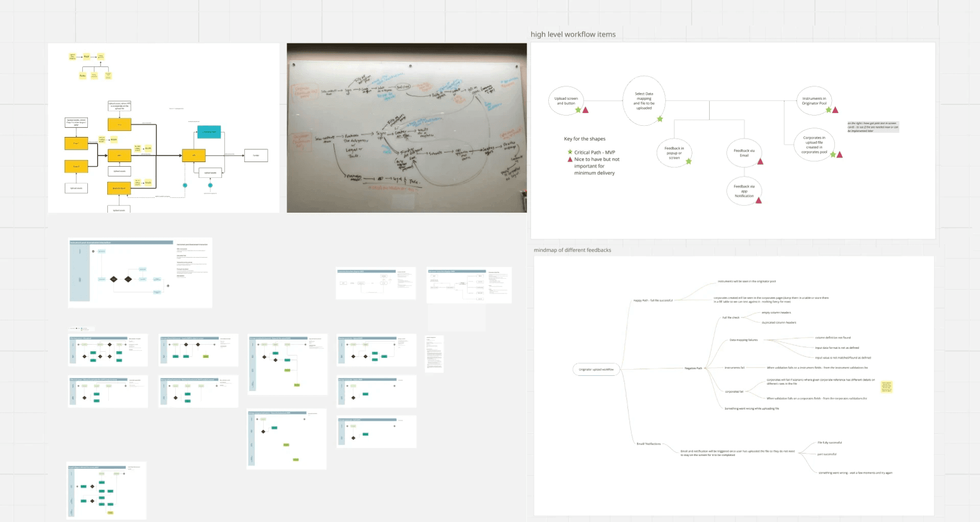
Early research artifacts: flow diagrams, whiteboard sketches, wireframes, and user journey maps documenting the fragmented workflow problems
Research & Discovery
Research & Discovery
8 user interviews across Originators, Risk Analysts, and Compliance Officers. 2 job shadowing sessions watching real onboarding flows. 2 edge case workshops with the broader team.
The pattern that emerged across every session: double working. Enter data → get rejected → spend 45 180 minutes in Excel tracing which rule was triggered → resubmit. One Originator put it directly: The system tells me something is wrong. It never tells me what.
A second finding from the Compliance Officer changed how we scoped the problem entirely: users under deadline pressure were submitting incomplete records hoping the system would let them through creating downstream data quality issues that took days to clean. The platform offered no middle ground between complete and rejected.
These weren't edge cases. They were the standard operating mode. The redesign had to start there.
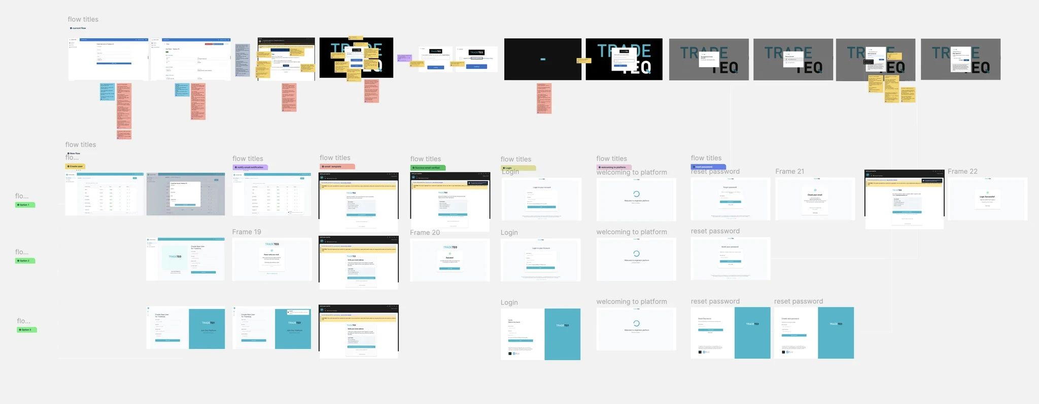
User research insights from 8 interviews, 2 job shadowing sessions, and 2 edge case studies revealing the double-working pattern and data quality issues
Information Architecture
Information Architecture
The old model was flat. A single trade instrument and a massive corporate pool sat at the same level of the hierarchy treated as equivalent objects. As data scaled, navigation collapsed. There was no way to zoom out to portfolio health or drill in to see which specific instruments were affecting a ratio. Context was always lost.
The new hierarchy reflects the actual domain: Corporate Entity → Corporate Pool → Instrument. Users can now move between levels with one click from a pool's overall health down to the specific instrument causing a drag on the numbers, and back up again.
Onboarding became non linear. The original flow was strictly sequential Step 1 had to be complete before Step 2 unlocked. But originators rarely arrive with everything they need in one session. The redesign made every section independently accessible: complete what you have, save, return with the rest. No data lost. No workarounds.
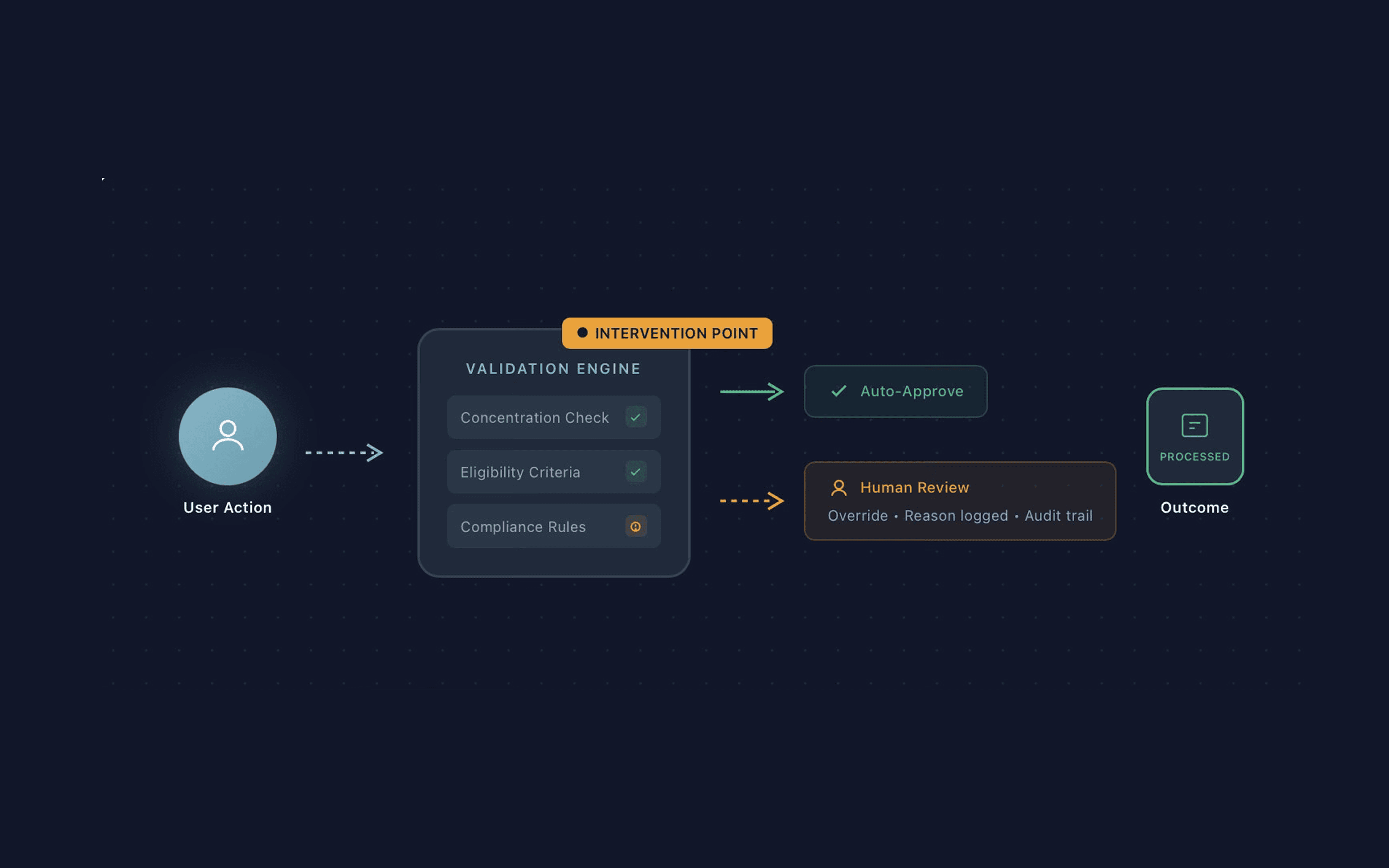
New three tier hierarchy (Corporate Entity → Pool → Instrument) replacing flat structure, with validation intervention points ensuring human oversight on exceptions.
Design Principles & Strategy
Design Principles & Strategy
Three principles, each a direct response to a specific observed failure.
1. Explain the Why
No error or status change without a human readable reason. If a pool is flagged, the system points to the exact rule not a code. This replaced the 45 minute Excel trace.
2. Graceful Failure
Designed intermediate holding states so users could save progress and return with missing data. Non-linear onboarding replaced the rigid Step A → Step B flow. This addressed the deadline-pressure submission problem directly.
3. Human in the Loop
Users retain final override capability on edge cases with every exception logged for audit. Getting this approved required alignment with the PM and risk team, who were concerned about users bypassing rules. The audit trail resolved it: exceptions became visible and accountable rather than invisible.

Before and after comparison showing consolidated navigation, improved data visualization, and streamlined workflows replacing scattered legacy interfaces.
The Unified Dashboard
The Unified Dashboard
Rather than three separate tools, the platform became a single system where every module shares state. A validation flag in the Corporates module surfaces contextually in the pool view. A document upload immediately informs the Instrument Registry.
The dashboard leads with four high level health indicators,Total Cash Position, FX Exposure, Debt Outstanding, Pool NAV and surfaces only items requiring action. Everything else is one click away.
This was the core lesson from testing: the first version showed everything at once. Users felt buried. The progressive disclosure model, summary up top, detail on demand was what made users feel in control.

Unified dashboard with high-level health indicators and two core journeys: focused Instrument Setup for precision work, and Corporate Pool Management for surveillance at scale.
Two Core Journeys
Two Core Journeys
The platform serves two fundamentally different cognitive modes. Keeping them visually distinct was a deliberate decision to reduce cognitive load.
Instrument Setup : precision and completeness. One error in one field can invalidate an entire submission. The design is narrow and focused, with inline validation so users get feedback as they go, not at the end.
Corporate Pool Management : pattern recognition across large datasets. The task is surveillance and triage: which pools carry risk, which instruments are dragging a ratio, where action is needed. The design shifts to data visualisation and at a glance status.

Technical — Designing for Latency
Technical — Designing for Latency
Financial compliance checks aren't instant. Sanctions lists, financial ratio validation, corporate registry cross referencing each takes time. Previously, this gap was invisible. Users assumed crashes. Many refreshed mid process and broke things.
I worked with engineering across three sessions to map every async process, its typical duration, and its failure modes. The result: named pending states that tell users exactly what's running not a spinner, but validating against sanctions register or awaiting counterparty confirmation.
Also designed stale data indicators that flag when displayed results are from a prior check cycle and a new one is in progress. This kept users from acting on outdated information.

Technical design patterns for async processes: named pending states, progress indicators, and design intervention checkpoints to manage latency gracefully.
Integrations
Integrations
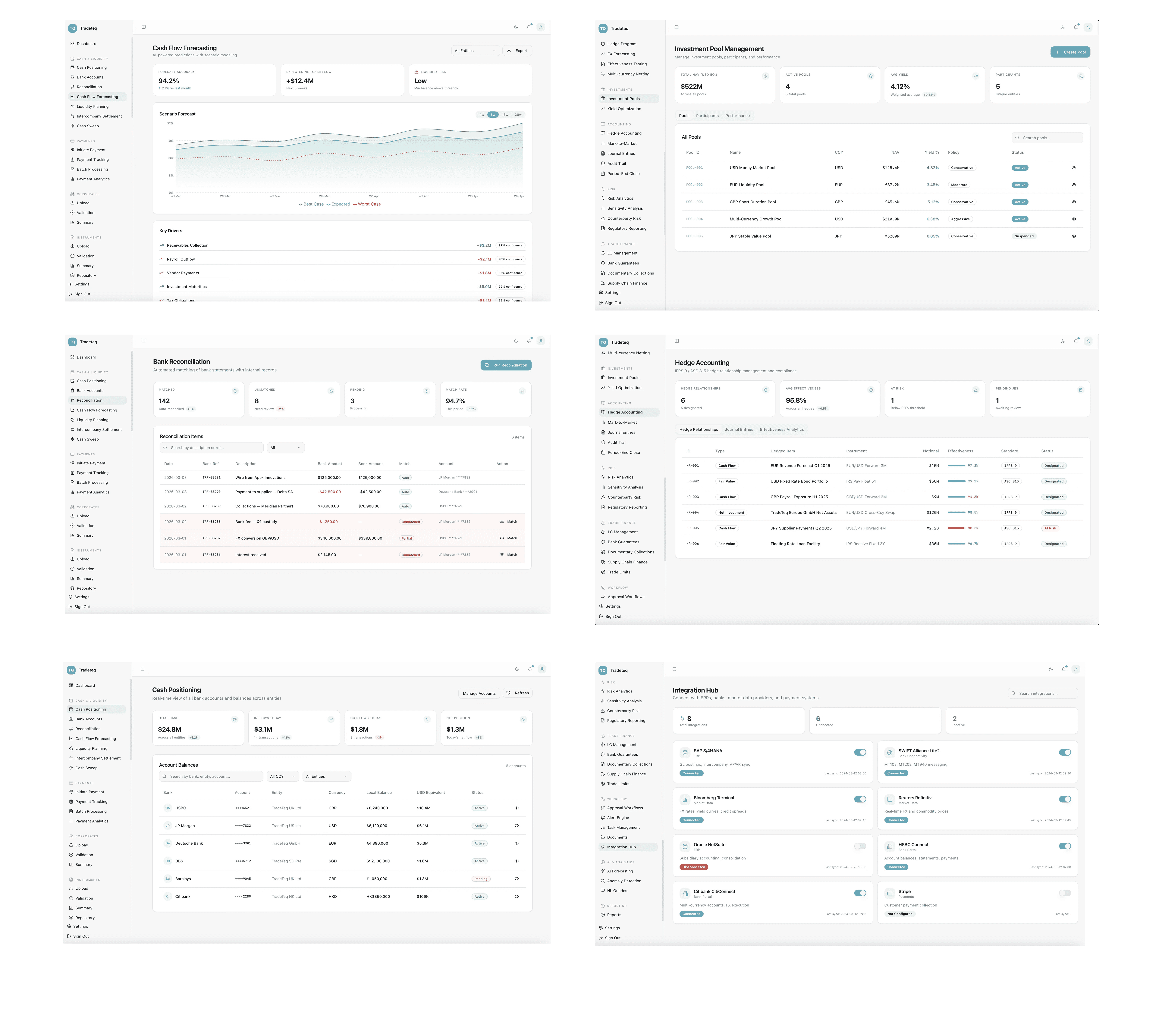
The Integration Hub connects the platform to ERPs, banks, and market data providers — SAP, Bloomberg, Reuters Refinitiv, HSBC, and others. Status (Connected / Disconnected / Not Configured) and last sync time are visible at a glance.
This was a trust surface as much as a utility. Users needed to know at any moment whether the data they were looking at was live.

Impact
Impact
Metric | Result | Context |
|---|---|---|
Validation Errors | −68% | 3 months post-launch vs. 3 months prior |
Onboarding Time | 3× faster | ~4 hours → under 80 minutes |
Support Tickets | −45% | Tracked over 60 days post-launch |
Beyond the numbers: the risk team reduced manual exception review time because originators were resolving data issues themselves. Engineering reported fewer false crash reports users now understood the difference between a validation rejection and a system error. The platform scaled operations during this period without adding headcount to manage exceptions, which had been a stated business goal from the start.

Platform screenshots showing delivered features across modules, demonstrating the end to end system redesign and measurable impact on validation errors, onboarding time, and support tickets
Reflection & Learnings
Reflection & Learnings
This project changed how I think about complexity in professional tools.
Simplicity that hides the system's reasoning isn't a feature in high stakes environments it's a liability. The original platform was visually clean. It just couldn't be trusted, because users had no way to verify what it was doing. What they needed wasn't less information. They needed structured information: the right detail, at the right moment, with a clear path to more.
The most consequential decision I made was treating engineering constraints as design inputs from day one. The pending states, the stale data indicators, the intervention points all designed from the inside out. If I were to do this again, I'd push for that engineering pairing to start even earlier, before any screen was sketched, mapping every failure mode and latency scenario first.
More Projects


UI / UX Design
Designing a Unified Corporate Finance Platform for Trade Finance Operations
Designing a Unified Corporate Finance Platform for Trade Finance Operations
Designing a Unified Corporate Finance Platform for Trade Finance Operations
How I transformed a fragmented system of uploads, validations, and pools into an integrated treasury management experience that professionals could finally trust.
Year :
2024
2024
Industry :
Finance
Finance
Client :
Tradeteq
Tradeteq
Project Duration :
1 Year
Introduction
Introduction
The platform was built for perfect data. Trade finance is anything but.
Originators were juggling three disconnected tools uploads, validation, pool management with no shared context between them. When something failed, the system said nothing useful. Users spent hours reverse engineering rejections in Excel. The platform had become something experts worked around, not with.
We weren't redesigning screens. We were rebuilding trust.
Early research artifacts: flow diagrams, whiteboard sketches, wireframes, and user journey maps documenting the fragmented workflow problems
Research & Discovery
Research & Discovery
8 user interviews across Originators, Risk Analysts, and Compliance Officers. 2 job shadowing sessions watching real onboarding flows. 2 edge case workshops with the broader team.
The pattern that emerged across every session: double working. Enter data → get rejected → spend 45 180 minutes in Excel tracing which rule was triggered → resubmit. One Originator put it directly: The system tells me something is wrong. It never tells me what.
A second finding from the Compliance Officer changed how we scoped the problem entirely: users under deadline pressure were submitting incomplete records hoping the system would let them through creating downstream data quality issues that took days to clean. The platform offered no middle ground between complete and rejected.
These weren't edge cases. They were the standard operating mode. The redesign had to start there.
User research insights from 8 interviews, 2 job shadowing sessions, and 2 edge case studies revealing the double-working pattern and data quality issues
Information Architecture
Information Architecture
The old model was flat. A single trade instrument and a massive corporate pool sat at the same level of the hierarchy treated as equivalent objects. As data scaled, navigation collapsed. There was no way to zoom out to portfolio health or drill in to see which specific instruments were affecting a ratio. Context was always lost.
The new hierarchy reflects the actual domain: Corporate Entity → Corporate Pool → Instrument. Users can now move between levels with one click from a pool's overall health down to the specific instrument causing a drag on the numbers, and back up again.
Onboarding became non linear. The original flow was strictly sequential Step 1 had to be complete before Step 2 unlocked. But originators rarely arrive with everything they need in one session. The redesign made every section independently accessible: complete what you have, save, return with the rest. No data lost. No workarounds.
New three tier hierarchy (Corporate Entity → Pool → Instrument) replacing flat structure, with validation intervention points ensuring human oversight on exceptions.
Design Principles & Strategy
Design Principles & Strategy
Three principles, each a direct response to a specific observed failure.
1. Explain the Why
No error or status change without a human readable reason. If a pool is flagged, the system points to the exact rule not a code. This replaced the 45 minute Excel trace.
2. Graceful Failure
Designed intermediate holding states so users could save progress and return with missing data. Non-linear onboarding replaced the rigid Step A → Step B flow. This addressed the deadline-pressure submission problem directly.
3. Human in the Loop
Users retain final override capability on edge cases with every exception logged for audit. Getting this approved required alignment with the PM and risk team, who were concerned about users bypassing rules. The audit trail resolved it: exceptions became visible and accountable rather than invisible.
Before and after comparison showing consolidated navigation, improved data visualization, and streamlined workflows replacing scattered legacy interfaces.
The Unified Dashboard
The Unified Dashboard
Rather than three separate tools, the platform became a single system where every module shares state. A validation flag in the Corporates module surfaces contextually in the pool view. A document upload immediately informs the Instrument Registry.
The dashboard leads with four high level health indicators,Total Cash Position, FX Exposure, Debt Outstanding, Pool NAV and surfaces only items requiring action. Everything else is one click away.
This was the core lesson from testing: the first version showed everything at once. Users felt buried. The progressive disclosure model, summary up top, detail on demand was what made users feel in control.
Unified dashboard with high-level health indicators and two core journeys: focused Instrument Setup for precision work, and Corporate Pool Management for surveillance at scale.
Two Core Journeys
Two Core Journeys
The platform serves two fundamentally different cognitive modes. Keeping them visually distinct was a deliberate decision to reduce cognitive load.
Instrument Setup : precision and completeness. One error in one field can invalidate an entire submission. The design is narrow and focused, with inline validation so users get feedback as they go, not at the end.
Corporate Pool Management : pattern recognition across large datasets. The task is surveillance and triage: which pools carry risk, which instruments are dragging a ratio, where action is needed. The design shifts to data visualisation and at a glance status.
Technical — Designing for Latency
Technical — Designing for Latency
Financial compliance checks aren't instant. Sanctions lists, financial ratio validation, corporate registry cross referencing each takes time. Previously, this gap was invisible. Users assumed crashes. Many refreshed mid process and broke things.
I worked with engineering across three sessions to map every async process, its typical duration, and its failure modes. The result: named pending states that tell users exactly what's running not a spinner, but validating against sanctions register or awaiting counterparty confirmation.
Also designed stale data indicators that flag when displayed results are from a prior check cycle and a new one is in progress. This kept users from acting on outdated information.
Technical design patterns for async processes: named pending states, progress indicators, and design intervention checkpoints to manage latency gracefully.
Integrations
Integrations
The Integration Hub connects the platform to ERPs, banks, and market data providers — SAP, Bloomberg, Reuters Refinitiv, HSBC, and others. Status (Connected / Disconnected / Not Configured) and last sync time are visible at a glance.
This was a trust surface as much as a utility. Users needed to know at any moment whether the data they were looking at was live.
Impact
Impact
Metric | Result | Context |
|---|---|---|
Validation Errors | −68% | 3 months post-launch vs. 3 months prior |
Onboarding Time | 3× faster | ~4 hours → under 80 minutes |
Support Tickets | −45% | Tracked over 60 days post-launch |
Beyond the numbers: the risk team reduced manual exception review time because originators were resolving data issues themselves. Engineering reported fewer false crash reports users now understood the difference between a validation rejection and a system error. The platform scaled operations during this period without adding headcount to manage exceptions, which had been a stated business goal from the start.
Platform screenshots showing delivered features across modules, demonstrating the end to end system redesign and measurable impact on validation errors, onboarding time, and support tickets
Reflection & Learnings
Reflection & Learnings
This project changed how I think about complexity in professional tools.
Simplicity that hides the system's reasoning isn't a feature in high stakes environments it's a liability. The original platform was visually clean. It just couldn't be trusted, because users had no way to verify what it was doing. What they needed wasn't less information. They needed structured information: the right detail, at the right moment, with a clear path to more.
The most consequential decision I made was treating engineering constraints as design inputs from day one. The pending states, the stale data indicators, the intervention points all designed from the inside out. If I were to do this again, I'd push for that engineering pairing to start even earlier, before any screen was sketched, mapping every failure mode and latency scenario first.
More Projects
UI / UX Design
Designing a Unified Corporate Finance Platform for Trade Finance Operations
Designing a Unified Corporate Finance Platform for Trade Finance Operations
Designing a Unified Corporate Finance Platform for Trade Finance Operations
How I transformed a fragmented system of uploads, validations, and pools into an integrated treasury management experience that professionals could finally trust.
Year :
2024
2024
Industry :
Finance
Finance
Client :
Tradeteq
Tradeteq
Project Duration :
1 Year
Introduction
Introduction
The platform was built for perfect data. Trade finance is anything but.
Originators were juggling three disconnected tools uploads, validation, pool management with no shared context between them. When something failed, the system said nothing useful. Users spent hours reverse engineering rejections in Excel. The platform had become something experts worked around, not with.
We weren't redesigning screens. We were rebuilding trust.
Early research artifacts: flow diagrams, whiteboard sketches, wireframes, and user journey maps documenting the fragmented workflow problems
Research & Discovery
Research & Discovery
8 user interviews across Originators, Risk Analysts, and Compliance Officers. 2 job shadowing sessions watching real onboarding flows. 2 edge case workshops with the broader team.
The pattern that emerged across every session: double working. Enter data → get rejected → spend 45 180 minutes in Excel tracing which rule was triggered → resubmit. One Originator put it directly: The system tells me something is wrong. It never tells me what.
A second finding from the Compliance Officer changed how we scoped the problem entirely: users under deadline pressure were submitting incomplete records hoping the system would let them through creating downstream data quality issues that took days to clean. The platform offered no middle ground between complete and rejected.
These weren't edge cases. They were the standard operating mode. The redesign had to start there.
User research insights from 8 interviews, 2 job shadowing sessions, and 2 edge case studies revealing the double-working pattern and data quality issues
Information Architecture
Information Architecture
The old model was flat. A single trade instrument and a massive corporate pool sat at the same level of the hierarchy treated as equivalent objects. As data scaled, navigation collapsed. There was no way to zoom out to portfolio health or drill in to see which specific instruments were affecting a ratio. Context was always lost.
The new hierarchy reflects the actual domain: Corporate Entity → Corporate Pool → Instrument. Users can now move between levels with one click from a pool's overall health down to the specific instrument causing a drag on the numbers, and back up again.
Onboarding became non linear. The original flow was strictly sequential Step 1 had to be complete before Step 2 unlocked. But originators rarely arrive with everything they need in one session. The redesign made every section independently accessible: complete what you have, save, return with the rest. No data lost. No workarounds.
New three tier hierarchy (Corporate Entity → Pool → Instrument) replacing flat structure, with validation intervention points ensuring human oversight on exceptions.
Design Principles & Strategy
Design Principles & Strategy
Three principles, each a direct response to a specific observed failure.
1. Explain the Why
No error or status change without a human readable reason. If a pool is flagged, the system points to the exact rule not a code. This replaced the 45 minute Excel trace.
2. Graceful Failure
Designed intermediate holding states so users could save progress and return with missing data. Non-linear onboarding replaced the rigid Step A → Step B flow. This addressed the deadline-pressure submission problem directly.
3. Human in the Loop
Users retain final override capability on edge cases with every exception logged for audit. Getting this approved required alignment with the PM and risk team, who were concerned about users bypassing rules. The audit trail resolved it: exceptions became visible and accountable rather than invisible.
Before and after comparison showing consolidated navigation, improved data visualization, and streamlined workflows replacing scattered legacy interfaces.
The Unified Dashboard
The Unified Dashboard
Rather than three separate tools, the platform became a single system where every module shares state. A validation flag in the Corporates module surfaces contextually in the pool view. A document upload immediately informs the Instrument Registry.
The dashboard leads with four high level health indicators,Total Cash Position, FX Exposure, Debt Outstanding, Pool NAV and surfaces only items requiring action. Everything else is one click away.
This was the core lesson from testing: the first version showed everything at once. Users felt buried. The progressive disclosure model, summary up top, detail on demand was what made users feel in control.
Unified dashboard with high-level health indicators and two core journeys: focused Instrument Setup for precision work, and Corporate Pool Management for surveillance at scale.
Two Core Journeys
Two Core Journeys
The platform serves two fundamentally different cognitive modes. Keeping them visually distinct was a deliberate decision to reduce cognitive load.
Instrument Setup : precision and completeness. One error in one field can invalidate an entire submission. The design is narrow and focused, with inline validation so users get feedback as they go, not at the end.
Corporate Pool Management : pattern recognition across large datasets. The task is surveillance and triage: which pools carry risk, which instruments are dragging a ratio, where action is needed. The design shifts to data visualisation and at a glance status.
Technical — Designing for Latency
Technical — Designing for Latency
Financial compliance checks aren't instant. Sanctions lists, financial ratio validation, corporate registry cross referencing each takes time. Previously, this gap was invisible. Users assumed crashes. Many refreshed mid process and broke things.
I worked with engineering across three sessions to map every async process, its typical duration, and its failure modes. The result: named pending states that tell users exactly what's running not a spinner, but validating against sanctions register or awaiting counterparty confirmation.
Also designed stale data indicators that flag when displayed results are from a prior check cycle and a new one is in progress. This kept users from acting on outdated information.
Technical design patterns for async processes: named pending states, progress indicators, and design intervention checkpoints to manage latency gracefully.
Integrations
Integrations
The Integration Hub connects the platform to ERPs, banks, and market data providers — SAP, Bloomberg, Reuters Refinitiv, HSBC, and others. Status (Connected / Disconnected / Not Configured) and last sync time are visible at a glance.
This was a trust surface as much as a utility. Users needed to know at any moment whether the data they were looking at was live.
Impact
Impact
Metric | Result | Context |
|---|---|---|
Validation Errors | −68% | 3 months post-launch vs. 3 months prior |
Onboarding Time | 3× faster | ~4 hours → under 80 minutes |
Support Tickets | −45% | Tracked over 60 days post-launch |
Beyond the numbers: the risk team reduced manual exception review time because originators were resolving data issues themselves. Engineering reported fewer false crash reports users now understood the difference between a validation rejection and a system error. The platform scaled operations during this period without adding headcount to manage exceptions, which had been a stated business goal from the start.
Platform screenshots showing delivered features across modules, demonstrating the end to end system redesign and measurable impact on validation errors, onboarding time, and support tickets
Reflection & Learnings
Reflection & Learnings
This project changed how I think about complexity in professional tools.
Simplicity that hides the system's reasoning isn't a feature in high stakes environments it's a liability. The original platform was visually clean. It just couldn't be trusted, because users had no way to verify what it was doing. What they needed wasn't less information. They needed structured information: the right detail, at the right moment, with a clear path to more.
The most consequential decision I made was treating engineering constraints as design inputs from day one. The pending states, the stale data indicators, the intervention points all designed from the inside out. If I were to do this again, I'd push for that engineering pairing to start even earlier, before any screen was sketched, mapping every failure mode and latency scenario first.